Preview image. Unlock full-res
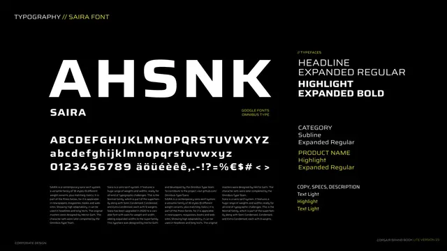
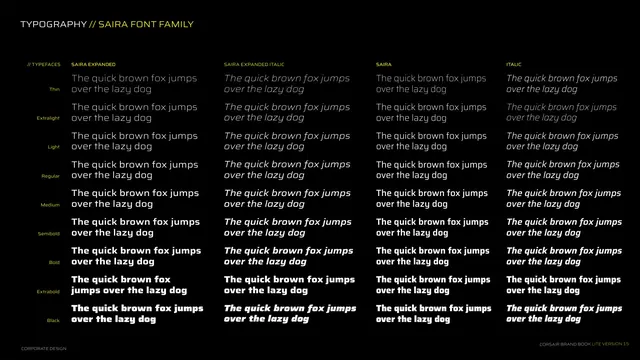
Full weight-and-width matrix of the Saira family from Thin to Black across Expanded, Expanded Italic, Saira and Italic, set as pangrams.
Summary
The Saira family matrix: nine weights from Thin to Black running down the rows, four width/style variants (Expanded, Expanded Italic, Saira, Italic) across the columns, each cell a pangram.
Visual description
Black background. Kicker "TYPOGRAPHY // SAIRA FONT FAMILY". A four-column table with a yellow "// TYPEFACES" header and column heads SAIRA EXPANDED, SAIRA EXPANDED ITALIC, SAIRA, ITALIC. Down the left edge, small grey weight labels: Thin, Extralight, Light, Regular, Medium, Semibold, Bold, Extrabold, Black. Each cell sets "The quick brown fox jumps over the lazy dog" in that weight and style, in white, getting visibly heavier toward the bottom. Footer left.
Key takeaway
Laying out the entire family as a weight x width grid of identical pangrams so the reader can compare every cut at once. It documents the full typographic range available, justifying a one-family system.
Reuse notes
The exhaustive specimen page for a large superfamily. Reuse the matrix layout whenever a brand standardizes on a single variable or multi-width family. Identical pangram per cell is what makes the comparison clean.