Preview image. Unlock full-res
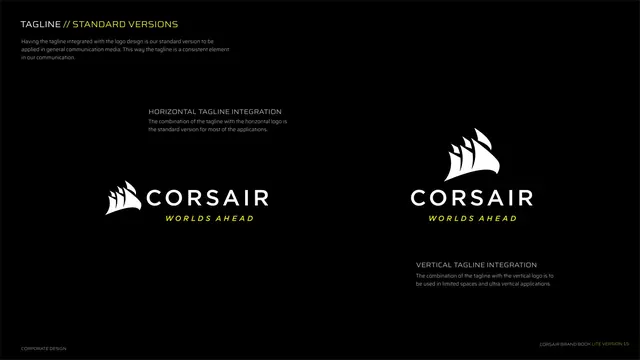
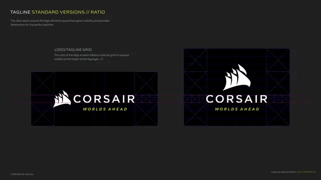
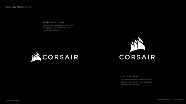
Shows the horizontal and vertical Corsair logo lockups with usage notes for each.
Summary
The two primary logo lockups side by side: the horizontal icon-plus-wordmark as the standard, and a stacked vertical version for tight spaces.
Visual description
Near-black background, two halves. Kicker top-left "LOGO // VERSIONS" (yellow second half). Left side shows the HORIZONTAL LOGO, the white sail-mark icon to the left of the CORSAIR wordmark, with a label and note calling it the standard for most applications. Right side shows the VERTICAL LOGO, the sail-mark stacked above the CORSAIR wordmark, noted for limited spaces and ultra-vertical applications. Both logos are large and centered within their halves. Footer left "CORPORATE DESIGN".
Key takeaway
Presenting both orientations on one page with a one-line "when to use" note each makes lockup selection unambiguous. Generous scale on the marks lets the reader study the construction.
Reuse notes
Standard logo-versions page for any identity that ships horizontal and vertical lockups. The clear "standard vs. constrained-space" framing is the reusable part. Keep both marks at comparable visual weight so neither reads as the afterthought.