Preview image. Unlock full-res
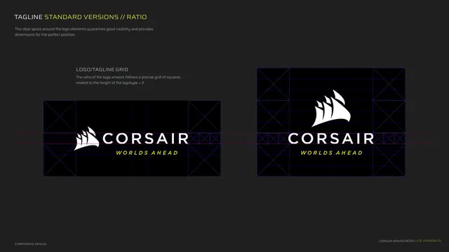
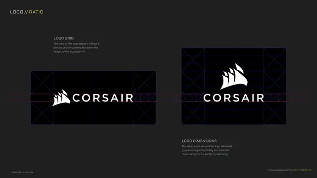
Construction page showing the logo built on a square grid with clear-space and dimension guides over both lockups.
Summary
The logo construction page: both lockups overlaid with a square grid and clear-space markers, with the logotype height defined as the unit X.
Visual description
Dark grey background, two halves. Kicker "LOGO // RATIO". Left half shows the horizontal lockup inside a blue square grid with diagonal-cross corner squares and a red centerline, captioned LOGO GRID explaining the ratio follows a precise grid of squares based on logotype height = X. Right half shows the vertical lockup with the same grid system, captioned LOGO DIMENSIONS about clear space guaranteeing visibility and correct positioning. Logos are white; guides are thin blue and red. Footer left.
Key takeaway
Defining the unit as the logotype height (X) and expressing the whole grid and clear space in multiples of it. The diagonal-cross corner squares are a clean visual convention for marking the minimum clear-space modules.
Reuse notes
Textbook construction-and-clear-space spread. Reuse the X-height-as-unit approach for any logo system; it scales the rules to any output size. Keep guide colors subtle (here thin blue/red) so the mark stays the focus.