Preview image. Unlock full-res
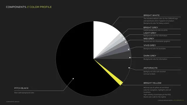
A pie chart of the brand color profile, mostly pitch black with white, a grey ramp and a thin yellow wedge, each labeled by role.
Summary
The color proportion page: a single pie chart showing how dominant pitch black is versus white, a grey ramp and a thin yellow wedge, with each slice labeled by its functional role.
Visual description
Dark background. Kicker "COMPONENTS // COLOR PROFILE". A large pie chart fills the left and center: the overwhelming majority is pitch black (labeled main dark background color), a top wedge is bright white (default for logo and heavy-content backgrounds), a fan of greys steps from bright grey through light, mid, vivid and dark grey (various information and example backgrounds), and a narrow bright-yellow wedge near the bottom (minimal use for navigation, highlights, calls to action, high POS visibility, tagline color). Thin leader lines connect each slice to a right-hand label and description. Footer left.
Key takeaway
Using a pie chart to encode color proportion as policy, not just to list colors but to show how little yellow and how much black the brand should be. Each slice carries its usage role, turning the chart into a quick allocation guide.
Reuse notes
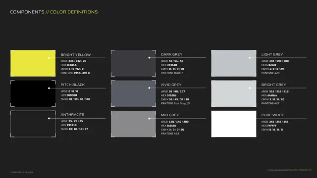
Strong device when the point of the palette is restraint and dominance ratios. It communicates "black-first, yellow-rarely" at a glance better than swatches alone. Pair with a hex/Pantone definitions page (the next page here) for the exact values.