Preview image. Unlock full-res
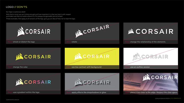
Nine-panel "don'ts" grid showing prohibited logo treatments, each struck through with a red diagonal.
Summary
The logo misuse page: a three-by-three grid of nine wrong treatments, each tile crossed by a red diagonal line and captioned with the prohibition.
Visual description
Black background. Kicker "LOGO // DON'TS" with an intro calling the logo a precious asset. Below, nine grey example tiles in a 3x3 grid, each showing a violated logo and a thin red diagonal strike, with a red "Don't" plus instruction along the bottom of each: don't stretch or distort, don't rotate, don't change the relationship of elements, don't change the color, don't use low contrast, don't use an outline version, don't use a gradient within the logo, don't apply effects like dropshadows or glow, don't place it too close to the edge. Footer left.
Key takeaway
The canonical nine-up "don'ts" grid with a consistent red diagonal as the universal "no" signal and a short caption per tile. Showing the exact failure modes (gradient-in-logo, outline, dropshadow) prevents the most common abuses.
Reuse notes
The standard misuse page every brand guide needs. Keep the strike color and caption format identical across all tiles. Reuse the same nine prohibitions as a strong default checklist for any wordmark-plus-icon logo.