Preview image. Unlock full-res
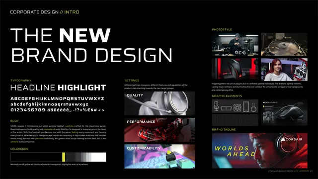
Dense single-page overview of the new brand design: typography, body, color code, settings imagery, photo style and graphic elements.
Summary
A one-page master overview of the new identity, tiling type rules, body specimen, color code, product settings, photography style and graphic elements into a three-column dashboard.
Visual description
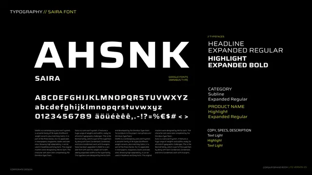
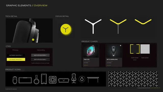
Black background, three loose columns. Top-left a large headline "THE NEW BRAND DESIGN" with NEW bolded in white. Left column: a TYPOGRAPHY block showing "HEADLINE HIGHLIGHT" plus a full Saira alphabet specimen, a BODY paragraph about a gaming headset, and a COLORCODE horizontal bar grading black to white with a yellow sliver, captioned about minimal use of yellow. Center column: SETTINGS with three stacked product cards labeled QUALITY, PERFORMANCE, CUSTOMIZABILITY over close-up peripheral photography. Right column: PHOTOSTYLE as a four-image grid of gamers and gear, GRAPHIC ELEMENTS showing product-icon line art and a key-features callout, and a BRAND TAGLINE banner with a backlit gamer and "WORLDS AHEAD" in yellow plus the CORSAIR logo. Footer right.
Key takeaway
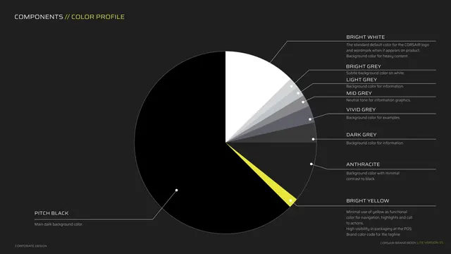
The single-page "everything at a glance" summary that previews the whole system before the detailed chapters. Labeling each mini-panel with a small all-caps header makes a dense page scannable. The black-to-white color bar with one yellow notch communicates the entire color strategy in one strip.
Reuse notes
Useful as a recap or a leave-behind one-sheet of an identity. It is intentionally dense, so it pairs best after a slower walk-through, or as a standalone summary for stakeholders. Keep panel headers in the same kicker style as the rest of the system for cohesion.