Preview image. Unlock full-res
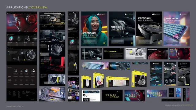
A dense wall of applications, web pages, social posts, print ads, packaging and tagline cards, showing the system at scale.
Summary
The application overview wall: dozens of touchpoints tiled together, web product pages, social posts, print ads, packaging boxes and "WORLDS AHEAD" cards, showing the identity deployed at scale.
Visual description
Grey presentation background. Kicker "APPLICATIONS // OVERVIEW". The page is a tight collage. Left columns show full dark e-commerce/product web pages with headset and fan heroes. Center and right show a grid of vertical "PRECISION UNLEASHED" ads, square social posts (PERFORMANCE, FUN FROM THE GROUND UP, SILENT POWER, HEADLINE SILENCE) with product photos and yellow accents, a row of physical product boxes (mouse, keyboard, headset packaging in black with yellow), and several black "WORLDS AHEAD" tagline cards in yellow italics. Footer left "APPLICATION EXAMPLES".
Key takeaway
A single overview wall that proves the system across web, social, print and packaging in one glance. Seeing many touchpoints together demonstrates cohesion better than any single mockup. Packaging shown in the same black/yellow logic extends the identity to physical product.
Reuse notes
The classic closing-applications montage for a brand guide. Use it to leave stakeholders with the impression of a complete, consistent ecosystem. It is intentionally dense and meant to be impressionistic rather than read in detail; keep individual mockups recognizable by silhouette and accent.