Preview image. Unlock full-res
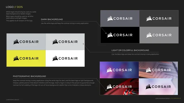
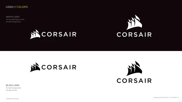
Shows the white logo on dark backgrounds and the black logo on light backgrounds, in a stacked half-black half-white split.
Summary
The logo color page: white logo for dark backgrounds shown on the top black band, black logo for light backgrounds shown on the bottom white band, each in both lockups.
Visual description
The page splits horizontally. The upper band is a very dark near-black field carrying the WHITE LOGO label and the white sail-mark in horizontal and vertical lockups. The lower band is pure white carrying the BLACK LOGO label and the black sail-mark in both lockups. Kicker top-left "LOGO // COLORS" (yellow second half). Notes state the standard logo is white for dark backgrounds and black for light backgrounds. The two lockups repeat on each band so the reader sees both orientations in both colorways.
Key takeaway
Demonstrating the reversal by literally splitting the page into a dark half and a light half, each holding the appropriate colorway. It shows the rule by example rather than describing it.
Reuse notes
Clean way to specify a two-color (white/black) logo system. The split-field layout instantly communicates "which version on which background". Reuse whenever a mark has exactly one positive and one reversed form.