Preview image. Unlock full-res
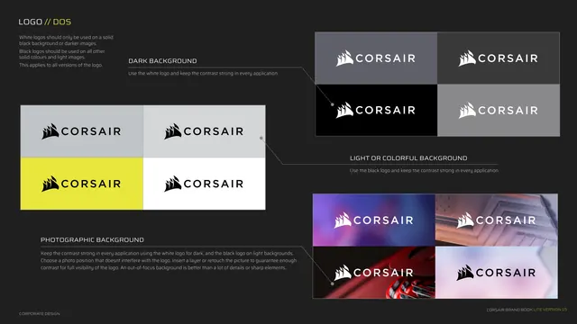
Correct logo usage grid showing white logo on dark, black logo on light or colorful, and contrast rules over photography.
Summary
The "do's" page for logo placement: how to keep strong contrast on dark, light, colorful and photographic backgrounds, each shown as a small swatch grid linked by callout lines.
Visual description
Dark grey background, three grouped example clusters. Kicker "LOGO // DOS". Intro text states white logos on solid black or darker images, black logos on all other solid colors and light images. Top-right cluster DARK BACKGROUND shows the white logo on grey, dark and black tiles. Center-left cluster LIGHT OR COLORFUL BACKGROUND shows the black logo on grey, yellow and white tiles. Bottom-right cluster PHOTOGRAPHIC BACKGROUND shows the logo over four product/scene photos, white on dark images and black on light, with a note to choose a non-interfering position and prefer out-of-focus backgrounds. Thin hairline leader lines connect each label to its swatch group. Footer left.
Key takeaway
Grouping the rules by background type (dark / light-or-colorful / photographic) and giving each its own swatch cluster. The hairline leader lines tying a label to its examples is the deck's recurring annotation device, used here for guidance.
Reuse notes
Comprehensive correct-usage spread. The photographic-background row is the most valuable, showing contrast handling on real imagery, which many guides skip. Reuse the three-bucket structure for any logo that lives on varied backgrounds.