Preview image. Unlock full-res
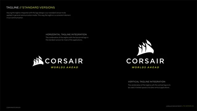
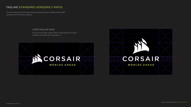
Construction page for the tagline lockups, both orientations on a square grid with clear-space guides.
Summary
The tagline-lockup construction page: horizontal and vertical tagline integrations placed on the same square grid system with clear-space markers.
Visual description
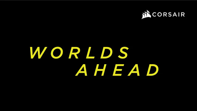
Dark grey background, two halves. Kicker "TAGLINE STANDARD VERSIONS // RATIO" with a clear-space note. Left half shows the horizontal CORSAIR-plus-"WORLDS AHEAD" lockup inside a blue square grid with diagonal-cross corner modules and a red centerline, captioned LOGO/TAGLINE GRID, the ratio following squares related to logotype height = X. Right half shows the vertical tagline lockup on the same grid. The wordmark is white, the tagline yellow italic, guides thin blue and red. Footer left.
Key takeaway
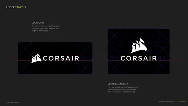
Extending the same X-height grid used for the bare logo to the tagline lockup, so both follow one construction logic. Keeping the clear-space system identical across logo and tagline versions.
Reuse notes
Pairs directly with the logo ratio page. Reuse when a tagline lockup needs its own documented spacing so it is not crowded in layout. Same subtle guide colors keep the lockup readable.