Preview image. Unlock full-res
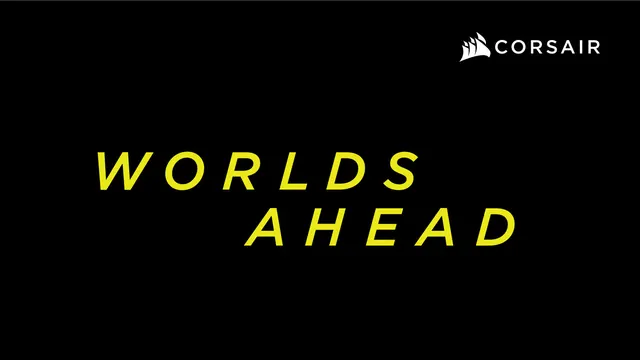
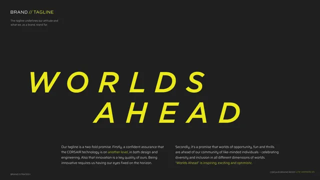
Explains the "WORLDS AHEAD" tagline with oversized yellow italic type and two supporting copy columns.
Summary
The tagline rationale page: "WORLDS AHEAD" rendered huge in yellow italics, with two paragraphs below explaining the two-fold promise behind it.
Visual description
Near-black background. Top-left kicker "BRAND // TAGLINE" (yellow second half) with a one-line description beneath. Center stage, "WORLDS" and "AHEAD" stack across two lines in oversized yellow italic all-caps Saira, heavily forward-slanted. Two body columns sit at the bottom: the left explains the tagline as a confident assurance that the technology is "on another level" and that innovation means eyes fixed on the horizon; the right frames it as a promise of opportunity, fun and thrills for a diverse community, closing on a yellow line "Worlds Ahead is inspiring, exciting and optimistic." Footer left "BRAND STRATEGY".
Key takeaway
Oversized italic display type as a way to make a static tagline feel like it is moving forward. Pairing one giant brand phrase with two balanced rationale columns is a tidy way to justify a tagline without a wall of text.
Reuse notes
Use when a tagline carries real strategic weight and deserves a full page. The forward italic slant reads as momentum, fitting for performance or sports brands; on a calmer brand it could feel aggressive. Keep the supporting columns short and let the phrase dominate.