
Preview image. Unlock full-res
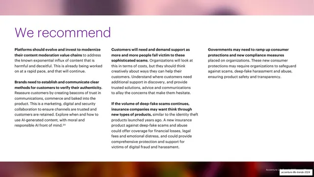
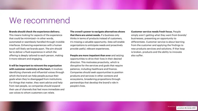
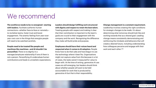
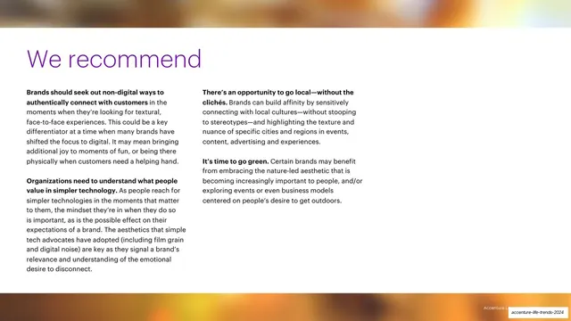
A white "We recommend" slide closing Trend 2, with an oversized purple headline over three columns of bold-lead-in recommendation paragraphs.
Summary
The recommendations slide that closes Trend 2 (the parent trap): a big purple "We recommend" headline sits above three columns of practical guidance for brands, each paragraph opening with a bold sentence.
Visual description
A white slide framed top and bottom by thin blurred multi-color gradient bands. An oversized purple sans-serif headline, "We recommend", anchors the upper left. Below it, three equal text columns each hold one or two recommendation blocks, where the opening sentence is set in bold near-black and the rest in lighter weight regular text. A faint right-aligned "Accenture Life Trends 2025" footer runs along the bottom.
Key takeaway
The "headline plus three bold-lead-in columns" pattern is a clean way to land a list of recommendations without bullets. Bolding only the first sentence of each paragraph gives skimmable structure while keeping a tidy text block.
Reuse notes
A reliable closing or summary layout for report and strategy decks that need to deliver several parallel takeaways at once. The thin gradient bands top and bottom signal a section boundary; reach for this to wrap a chapter. Works best on a clean light background with generous column gutters.
From this deck: Trend 2 recommendations three-column
View deck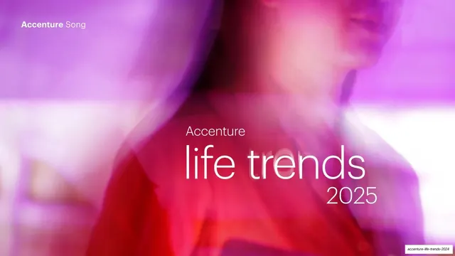















More like this





Keep what you find
A free account saves references to boards and can send you a weekly email of picks based on what you save.
To see every result, go Pro.