Preview image. Unlock full-res
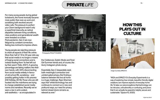
Editorial article spread on black titled "PRIVATE LIFE" with three columns of body copy, a black-and-white documentary photo, and a "How this plays out in culture" side rail.
Summary
The "PRIVATE LIFE" article page on black: multi-column body copy about post-pandemic privacy, anchored by a black-and-white documentary photo and the recurring "HOW THIS PLAYS OUT IN CULTURE" side rail.
Visual description
Near-black full bleed. A centered light pill at top holds "PRIVATE LIFE" ("LIFE" in italic); the section header "IMPERMACULTURE V. CONNECTED HOMES" is top-left and page "75" top-right. Columns of small white body copy run across the left and center about young people rejecting always-on social media. Center-top sits a black-and-white photo of a person and dog behind a chain-link fence by a clapboard house, with a "Photography PHILLIP YOUMANS" credit. The right column carries the bold white sub-heading "HOW THIS PLAYS OUT IN CULTURE" above a small photo of feet on a wooden floor beside a stretched plastic sheet (credited to SPACE10), then a closing paragraph and an attributed quote about IKEA and SPACE10's Everyday Experiments. The white "impermaculture" badge sits bottom-right.
Key takeaway
The same article template carried with restraint: this spread leans almost entirely monochrome, letting a single grainy documentary photograph and the side-rail sub-heading structure pages of prose. Repeating the exact layout grammar from the previous slide is what makes a long report feel like one designed object.
Reuse notes
A good reference for text-heavy report pages that must stay visually quiet. Reusing one fixed article grid across consecutive slides (pill header, multi-column body, culture side rail) is the lesson here. Black-and-white photography keeps the tone serious; swap in your own imagery without touching the structure.
From this deck: Private Life article spread
View deck






















More like this







Keep what you find
A free account saves references to boards and can send you a weekly email of picks based on what you save.
To see every result, go Pro.