
Preview image. Unlock full-res
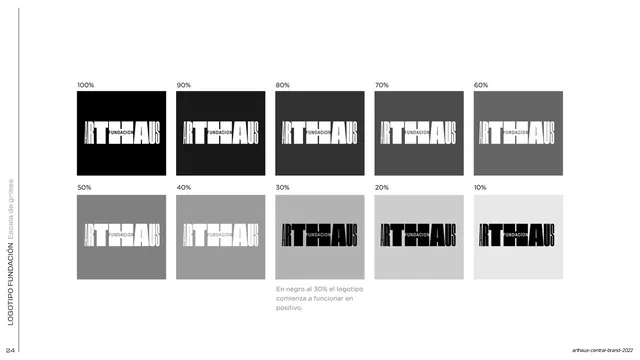
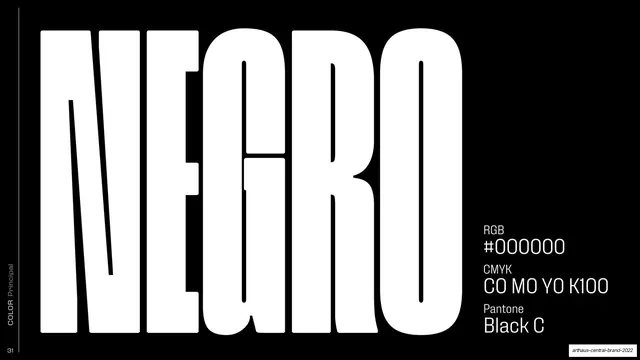
The ARTHAUS Fundacion lockup reversed: a massive white horizontal wordmark on black with FUNDACION knocked through the central letters.
Summary
The negative counterpart to the Fundacion lockup: a huge white ARTHAUS logotype on a solid black field, with FUNDACION reading through the center of the mark.
Visual description
Solid black full bleed with a rotated "LOGOTIPO FUNDACION / Negativo" side label up the left edge. The oversized horizontal "ARTHAUS" wordmark fills the middle in white, set in the same heavy condensed display face with tightly interlocking letters. The word "FUNDACION" runs across the center; here it reads in black (the background color) through the body of the white letters, again embedding the sub-brand into the mark itself. Layout mirrors the positive version on the facing page.
Key takeaway
Pairing the positive and negative Fundacion locks as facing pages so the brand book proves the mark survives a full tonal flip. The reversed treatment keeps the same internal FUNDACION integration, reinforcing it as one mark in either polarity.
Reuse notes
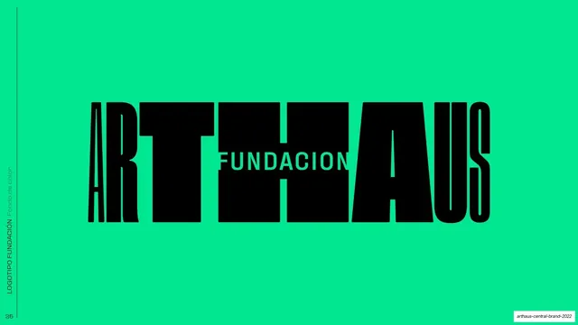
The companion to the positive Fundacion slide; show them as a spread. The black-field version is the one to reach for on dark applications, posters, and covers. Same caveat: only works with a heavy, tall logotype that can hold reversed inner text.
From this deck: ARTHAUS Fundacion logotype negative
View deck

































More like this




Keep what you find
A free account saves references to boards and can send you a weekly email of picks based on what you save.
To see every result, go Pro.