
Preview image. Unlock full-res
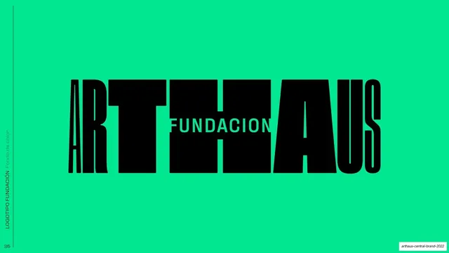
Clear-space diagram for the horizontal Fundacion lockup, the black-and-teal wordmark boxed by cyan margin and rounded padding guides.
Summary
The clear-space construction page for the horizontal Fundacion lockup, defining minimum margins with nested cyan boxes and rounded padding swatches around the mark.
Visual description
White full bleed with a rotated "LOGOTIPO FUNDACION / Area de seguridad" side label up the left edge. Centered is the wide "ARTHAUS" Fundacion lockup, mostly black with a teal "US" at the end and "FUNDACION" knocked out white through the middle. Two nested cyan rectangles bound the mark, an inner box tight to the letters and an outer margin, with soft rounded pale-cyan blocks marking the padding increment on each side, top, and bottom. The construction echoes the vertical-lockup safe-area page earlier in the deck.
Key takeaway
Reusing the exact same cyan box-plus-rounded-padding clear-space language for the horizontal lock as for the vertical one, keeping the construction system consistent across every logo orientation in the book. The teal accent letter shows the mark's color variant within the construction frame.
Reuse notes
The horizontal counterpart to the vertical safe-area slide; present them in parallel so the spacing system reads as one method. The rounded-swatch padding device is a clean, friendly alternative to the usual X-height grid.
From this deck: ARTHAUS Fundacion logotype safe area
View deck

































More like this








Keep what you find
A free account saves references to boards and can send you a weekly email of picks based on what you save.
To see every result, go Pro.