
Preview image. Unlock full-res
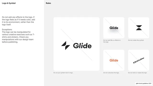
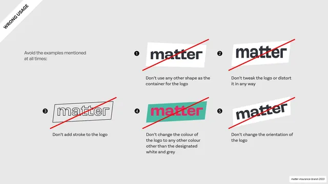
Light slide of logo don'ts shown as a 4x2 grid of eight cards, each a red-X-labeled example of a prohibited treatment of the wordmark or icon.
Summary
A grid of logo don'ts: eight cards, each topped with a red-X label and showing one prohibited treatment of the wordmark or M icon, from breaking clear space to recolouring, transforming, or locking up the icon with the wordmark.
Visual description
Off-white (#F2F8F3) background. Top-left: an outlined "Our logo" pill, a deep-navy "Things to avoid" heading, and "Our logo don'ts." Below, eight rounded cards in a 4x2 grid. Each card has a small coral circular X icon and a caption, then a visual of the violation: don't break clear space (cropped on a coral block), don't overlay over text, don't apply effects (drop-shadowed monzo), don't use legacy logos (M+wordmark on navy), don't recolour (purple monzo), don't transform (skewed monzo), don't use the legacy icon, don't lock up the M icon with the wordmark. A "12" marker sits top-right.
Key takeaway
The dense 4x2 don'ts grid that catalogs many misuses on one slide, each flagged with the same red-X marker for instant parsing. Showing the wrong version directly (rather than describing it) makes each rule unmistakable.
Reuse notes
A standard but well-executed "things to avoid" page for a logo section. The repeated red-X and uniform card size are what make eight rules readable at once; keep every violation visually obvious and labeled in one short line.
From this deck: Logo things to avoid
View deck
















































































More like this







Keep what you find
A free account saves references to boards and can send you a weekly email of picks based on what you save.
To see every result, go Pro.