
Preview image. Unlock full-res
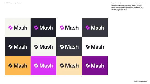
A swatch matrix pairing background colors with allowed text or content colors for accessible contrast.
Summary
A contrast-pairing matrix: each card shows a background color band over a content color band, demonstrating only the approved background-to-text combinations.
Visual description
Warm off-white ground. A grid of small two-band cards, three rows of six, sits center-right. Left margin labels read "BACKGROUND" (upper band) and "CONTENT (TEXT, GRAPHICS)" (lower band). The top row pairs dark charcoal backgrounds with cream, amber, pale-amber, magenta, and purple content; middle row pairs purple and magenta backgrounds with cream or charcoal content; bottom row pairs cream backgrounds with charcoal, grey, purple, and magenta content. A right-aligned note at top right says to use only these combinations when content sits on a solid background, for contrast and accessibility. Header: "ACCEPTABLE COMBINATIONS" / "COLOR PALETTE" / "BRAND GUIDELINES".
Key takeaway
Encoding allowed contrast as paired background/content swatch cards rather than prose, so designers can match a real pairing at a glance. The two-band card is a compact, repeatable unit for an accessibility rule.
Reuse notes
A useful companion to a master palette whenever a brand has saturated colors that cannot all sit on each other. The card matrix scales to any number of approved pairs; keep the BACKGROUND/CONTENT labels visible so the reading order is unambiguous.
From this deck: Mash acceptable color combinations
View deck








































More like this






Keep what you find
A free account saves references to boards and can send you a weekly email of picks based on what you save.
To see every result, go Pro.