Preview image. Unlock full-res
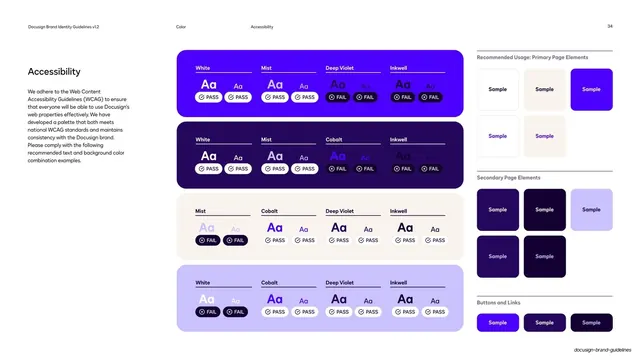
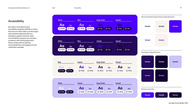
Light guideline page testing brand color pairings for WCAG contrast, with PASS/FAIL badges on big "Aa" swatch grids plus a right-hand sample panel.
Summary
A light accessibility reference page that audits Docusign's color pairings against WCAG contrast, marking each text-on-background combination PASS or FAIL with a pill badge.
Visual description
White background. The standard three-zone running header runs across the top: "Docusign Brand Identity Guidelines v1.2" left, then two centered all-caps labels "Color" and "Accessibility", with the page number "34" far right. A left column holds the heading "Accessibility" and a short body paragraph about complying with WCAG. The center is a stack of four large rounded color blocks (cobalt, deep violet, cream, and pale lilac), each subdivided into four labeled columns (White, Mist, Deep Violet, Cobalt, Inkwell). Within each column a big "Aa" specimen sits above a small pill badge reading PASS (checkmark) or FAIL (cross), so legibility is shown rather than just stated. A right-hand panel headed "Recommended Usage" shows smaller sample cards for Primary Page Elements, Secondary Page Elements, and Buttons and Links, separated by hairline rules.
Key takeaway
Proving contrast visually instead of listing ratios: every text-and-fill pairing carries a literal PASS or FAIL pill next to a real "Aa" specimen, so the rule is self-evident at a glance. The four big color blocks act as both the swatch and the test bed at once.
Reuse notes
A strong template for the accessibility page of any brand or design-system guideline, especially one with a saturated palette where contrast is a real risk. The PASS/FAIL pill pattern is directly reusable for documenting approved versus prohibited color pairings. Needs a defined palette with named colors to populate the column headers.
From this deck: Accessibility WCAG color combinations
View deck














More like this

Keep what you find
A free account saves references to boards and can send you a weekly email of picks based on what you save.
To see every result, go Pro.