Preview image. Unlock full-res
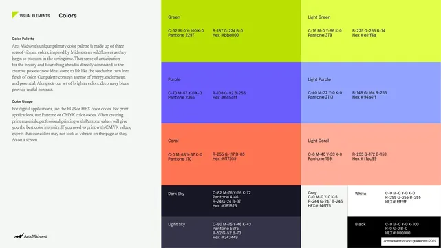
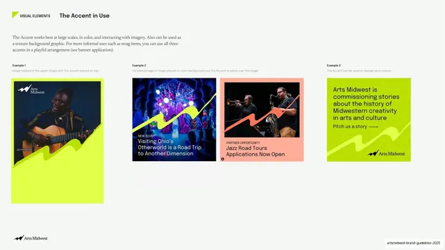
Light slide with a left text column and a large right grid of color blocks, each giving CMYK, Pantone, RGB, and hex for green, purple, coral, plus navy, gray, white, and black.
Summary
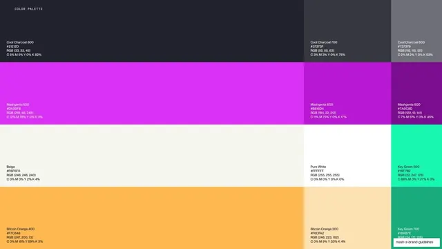
The full color-spec page: a serif explanation on the left and a large grid of solid color blocks on the right, each labeled with its CMYK, Pantone, RGB, and hex values.
Visual description
Pale off-white left third holds the running header ("VISUAL ELEMENTS", bold "Colors"), a "Color Palette" paragraph on the wildflower inspiration, and a "Color Usage" paragraph on print versus digital codes, all in serif. The right two-thirds is a tiled grid of full-bleed color blocks: top row Green (Pantone 2297) and Light Green (Pantone 379); middle row Purple (2366) and Light Purple (2113); next row Coral (170) and Light Coral (169); each block carries its CMYK and RGB/hex values set in small text in the block's own contrasting ink. The bottom row breaks into smaller cells for Dark Sky and Light Sky navy tones, plus Gray, White, and Black, each with full values. The Arts Midwest logo runs bottom-left.
Key takeaway
Pairing each brand color with its bright "light" companion in a two-up grid, so the palette reads as structured pairs rather than a flat list. Printing the CMYK/Pantone/RGB/hex values directly inside each swatch in its own contrasting ink keeps the spec self-contained and copy-ready.
Reuse notes
The canonical palette-spec layout for any brand book: left rationale, right value grid. The primary-plus-light pairing and in-swatch value blocks transfer directly. Data-dense, so it relies on large swatches and tight, consistent value formatting to stay scannable.
From this deck: Color palette spec, full swatch grid with values
View deck




























More like this




Keep what you find
A free account saves references to boards and can send you a weekly email of picks based on what you save.
To see every result, go Pro.