Preview image. Unlock full-res
Bilingual Arabic and English brand guidelines for a Saudi Eastern Province creative initiative, built on a wave logo motif and a five-color palette.
Summary
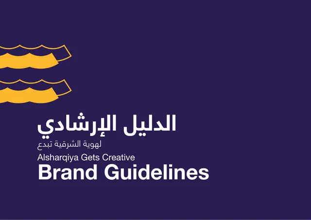
A 19-page bilingual Arabic and English brand guideline for "Alsharqiya Gets Creative," a creative-tourism initiative for Saudi Arabia's Eastern Province. The whole system hangs off one motif: a stacked wave shape drawn from the region's sea heritage, recolored per section.
Visual description
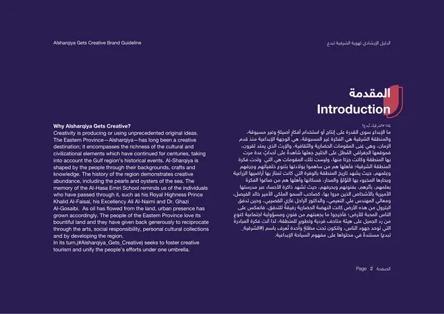
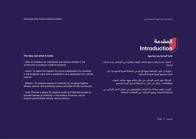
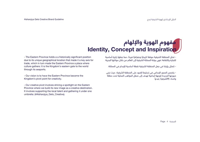
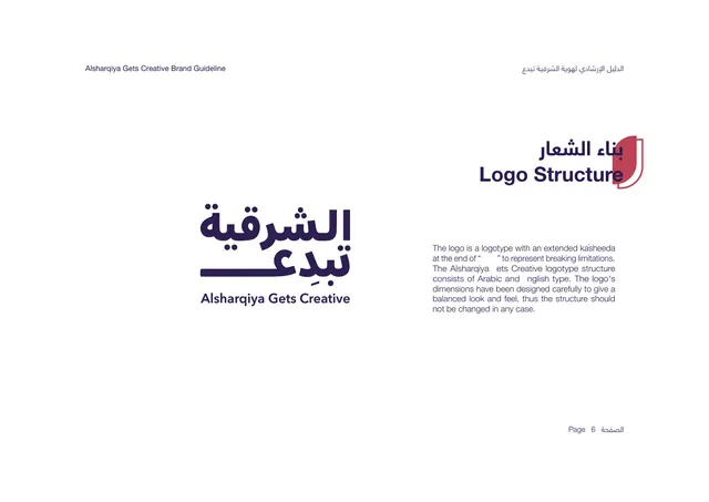
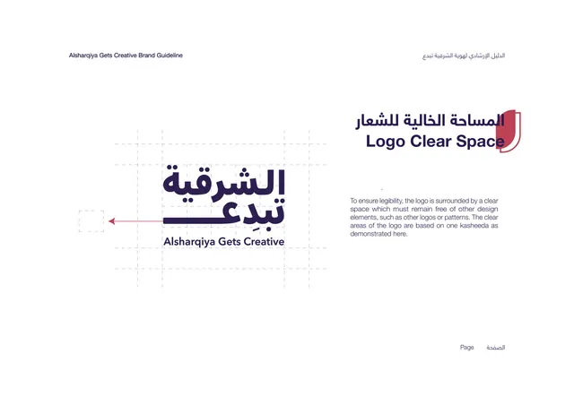
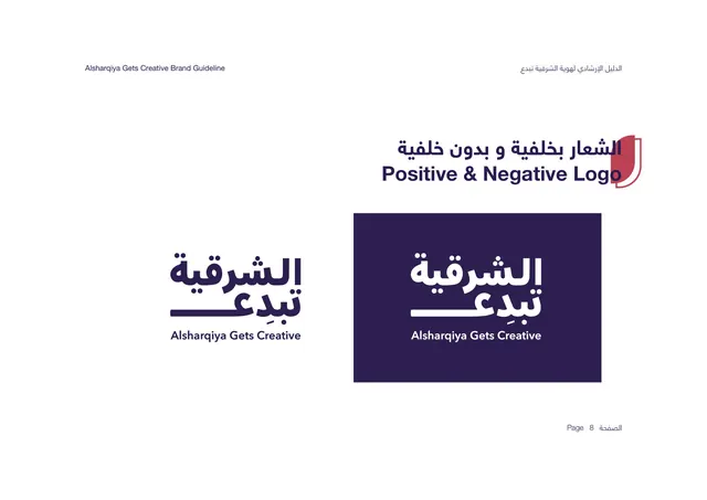
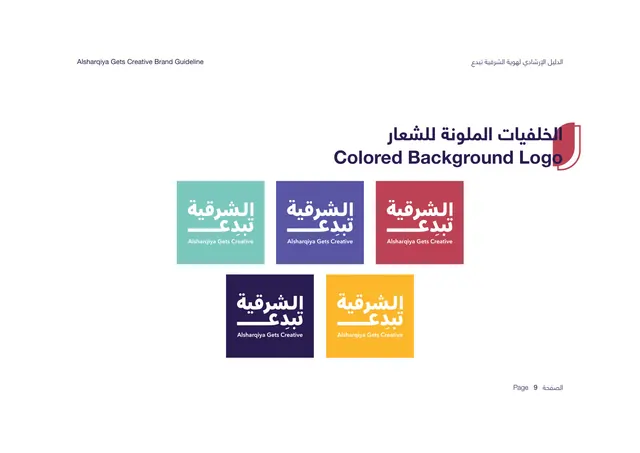
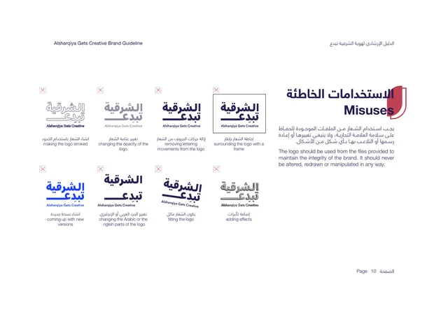
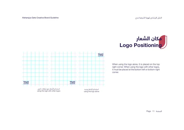
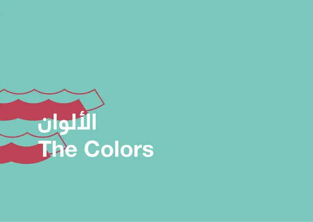
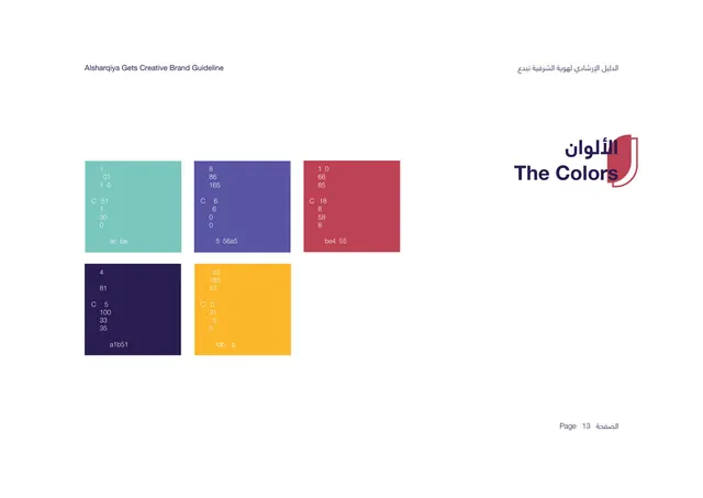
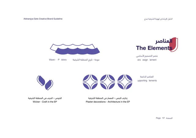
Landscape format with a consistent two-language grammar: English set left-to-right on the left, Arabic set right-to-left on the right, with a recurring red shield-and-kasheeda tab anchoring each section title in the top-right. Section dividers are full-bleed solid color fields (deep purple, periwinkle, teal) with the same overlapping wave graphic bleeding off the left edge and a large bilingual title stacked low-left. Content pages sit on either a deep indigo or white ground with generous empty space and small running headers. The palette is five flat, saturated colors: deep indigo-purple, golden yellow, mint teal, periwinkle blue, and a brick red. Typography pairs a geometric Arabic display face with a clean grotesque-style Latin sans, both used in heavy weights for titles and regular weights for body copy. The logo is a bilingual wordmark with an extended kasheeda stroke; the guide documents its structure, clear space, positive and negative versions, colored-background versions, misuses, and positioning. A motif library (wave, wicker, plaster decoration) generates three vertical patterns shown one per panel.
Key takeaway
The single wave motif treated as a flexible system: same shape, restated as a full-bleed section graphic, a logo flourish, and a tileable pattern, recolored to mark each chapter. The disciplined bilingual mirror layout (English-left, Arabic-right, shared red tab) is a clean template for any RTL-plus-LTR identity. The chapter dividers earn their place by being pure color plus motif, no body copy.
Reuse notes
A strong reference for bilingual Arabic and English brand systems, culturally-rooted identities, and tourism or government-adjacent initiatives that need warmth without losing structure. The five-color flat palette and motif-to-pattern pipeline travel well to events, signage, and social. Note the deck leans heavily on a single motif, so it works best when that motif is as strong as this wave; the layout itself assumes a wide landscape canvas.
From this deck: Alsharqiya Gets Creative brand guidelines
View deck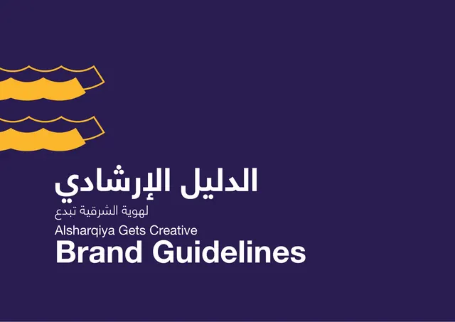
More like this





Keep what you find
A free account saves references to boards and can send you a weekly email of picks based on what you save.
To see every result, go Pro.