Preview image. Unlock full-res
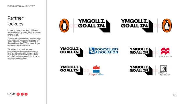
White page showing the Ymgolli mark locked up with publisher partner logos, with clear-space rules based on the width of the O.
Summary
The partner-lockup page: the Ymgolli mark paired with several publisher logos, governed by a clear-space rule set to the width of the wordmark's "O".
Visual description
White background. Left sidebar carries the eyebrow "YMGOLLI VISUAL IDENTITY", the two-line title "Partner lockups", and three explanatory paragraphs: partner logos will often sit beside ours; clear space equals the width of the "O" from the logo; and the order (partner before or after) is decided only by the relationship agreed, both equally permissible. The right area is a grid of six lockups pairing the "YMGOLLI. GO ALL IN." mark (with chevron shadow) and a thin vertical divider with partner marks: Penguin (orange oval) on the left and right of the top row, then Booksellers Association, Pan Macmillan, HarperCollins and Simon & Schuster. Faint pink "O" shapes mark the clear-space gap. "HOME" nav bottom-left, page "12" bottom-right.
Key takeaway
Defining clear space as the width of a specific letterform from the logo (the "O") is a memorable, scalable measure. Showing the mark both preceding and succeeding partners on one page settles ordering questions immediately.
Reuse notes
Reuse for any brand that frequently co-locks with partners or sponsors. The letterform-based clear-space unit travels with the logo at any size, which is more robust than a fixed pixel gap.
From this deck: Partner lockups
View deck



More like this




Keep what you find
A free account saves references to boards and can send you a weekly email of picks based on what you save.
To see every result, go Pro.