Preview image. Unlock full-res
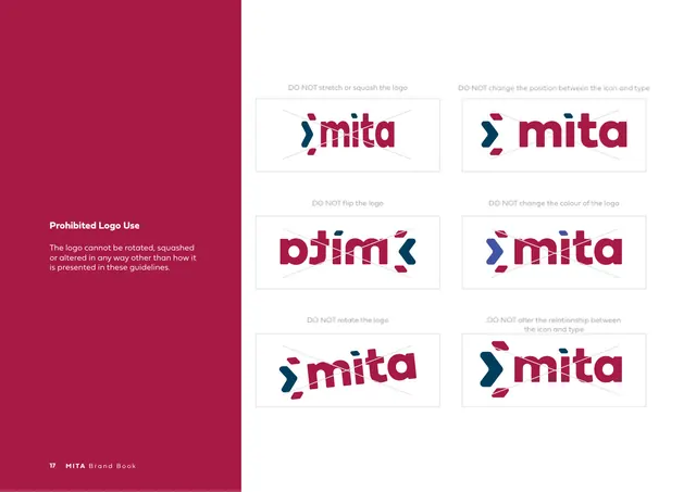
Don'ts page with a crimson sidebar and a 2x3 grid of six crossed-out logo misuses (stretch, flip, rotate, recolour, reposition).
Summary
The "Prohibited Logo Use" page: a crimson left sidebar with the rule, and a six-cell grid of crossed-out logos showing what not to do.
Visual description
A vertical crimson band runs down the left third holding a white bold heading "Prohibited Logo Use" and a short rule that the logo cannot be rotated, squashed or altered. The right two-thirds is white with a 2x3 grid of bordered cells, each showing a misused logo struck through with a faint X and a gray caption: do not stretch or squash, do not change the position between icon and type, do not flip, do not change the colour, do not rotate, do not alter the relationship between icon and type. Footer: "17 MITA Brand Book".
Key takeaway
A compact six-up grid of crossed misuses, each with a one-line caption, is the clearest possible "don'ts" layout. The crimson sidebar isolates the rule from the examples and adds a colour break to an otherwise white page.
Reuse notes
The standard prohibited-use page; reuse the 2x3 (or 2xN) crossed-example grid for any logo. Captions should name the specific abuse. The sidebar-plus-grid split keeps the rule and the examples visually separate.
From this deck: Prohibited Logo Use
View deck





More like this





Keep what you find
A free account saves references to boards and can send you a weekly email of picks based on what you save.
To see every result, go Pro.