
Preview image. Unlock full-res
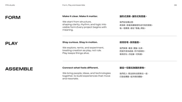
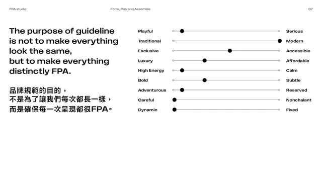
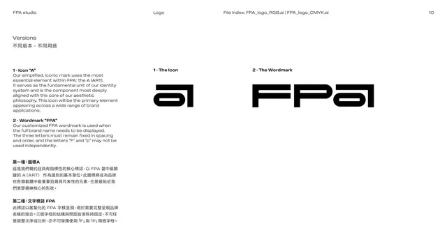
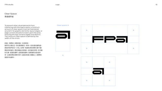
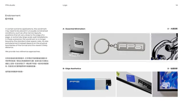
Endorsement page showing the a icon and wordmark in cropped, tiled, boxed, circular and rounded-square treatments under Essential Minimalism.
Summary
A grid of icon treatments: the "a" mark cropped to its corner, stacked and mirrored, tiled in a strip, set in a grey box, on a light circle, and as a black rounded-square app icon, all under "A - Essential Minimalism".
Visual description
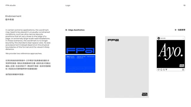
White page. The left column repeats the endorsement text in English over Chinese. The right side is a loose grid of black-and-grey icon studies on pale grey tiles: a large "a" cropped so it bleeds off its box, a vertical pair of mirrored icons, a horizontal strip of repeated "a" marks, the FPA wordmark inside a grey panel, the icon centered on a light-grey circle, and a black rounded-square containing a white "a" (an app-icon style). Strictly black, white and grey.
Key takeaway
Showing the icon cropped, tiled and containerized demonstrates its flexibility as a graphic device, not just a fixed logo. The rounded-square white-on-black version doubles as an app-icon spec.
Reuse notes
A good "expressive usage" page proving an icon can be pushed (cropped, repeated, framed) without breaking. Reuse when the mark is simple enough to survive heavy cropping. Keep these studies tonal so they stay clearly secondary to the primary lockups.
From this deck: Endorsement icon variations
View deck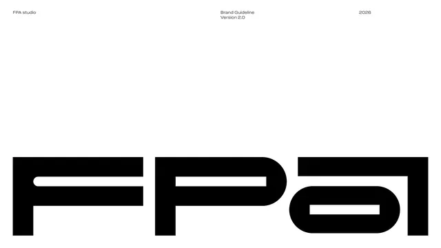











More like this



Keep what you find
A free account saves references to boards and can send you a weekly email of picks based on what you save.
To see every result, go Pro.