Preview image. Unlock full-res
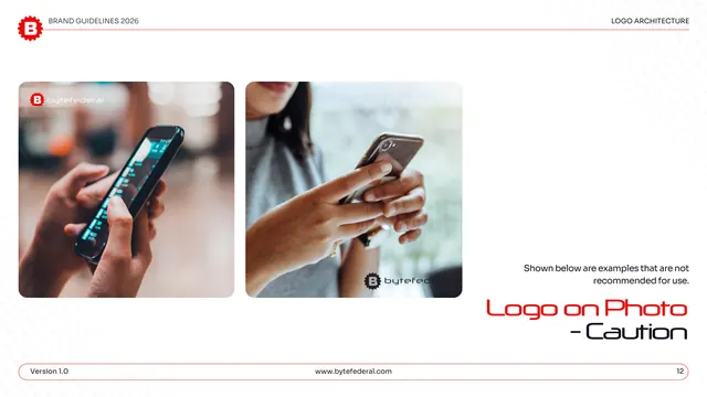
Caution counterpart to the logo-on-photo page, showing the mark placed over busy, low-contrast areas where legibility fails.
Summary
The not-recommended logo-on-photo page: the mark placed over cluttered, low-contrast areas of two lifestyle photos so it gets lost.
Visual description
White page, "LOGO ARCHITECTURE" header. Two rounded lifestyle image cards show phones in use: left, the white logo sits over a busy, bright phone screen where it nearly disappears; right, the dark logo is dropped over a light, detailed background at the lower right with poor separation. A right-hand gray note reads "Shown below are examples that are not recommended for use." "Logo on Photo - Caution" sits large lower right, split across red and black display lines; the pill footer shows page "12."
Key takeaway
Putting the mark over the worst part of each image (a glaring screen, a cluttered light area) makes the legibility failure obvious. Keeping the layout identical to the approved page sharpens the do/don't contrast.
Reuse notes
Use right after the approved photography page. A practical teaching device for brands whose logo often lands on uncontrolled user or stock imagery. The deliberately bad placements are the lesson, not a flaw.