Preview image. Unlock full-res
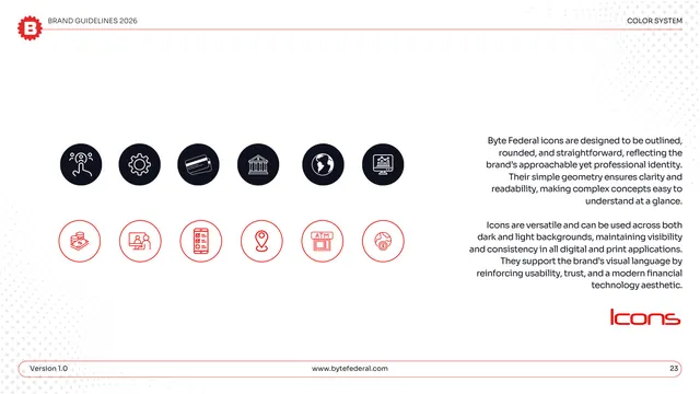
Iconography page showing outlined, rounded finance icons in two rows, one reversed in dark circles and one as red outlines.
Summary
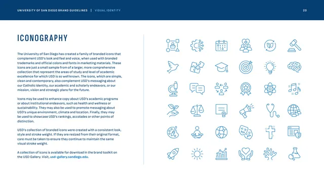
The iconography: two rows of simple line icons for finance concepts, the top set reversed white in dark circles and the bottom set as red outlines in light circles, showing both background treatments.
Visual description
White page under "COLOR SYSTEM." Twelve icons sit in two rows of six. The top row is white line icons inside near-black filled circles: a person/touch, a gear, a card, a bank, a globe, a chart monitor. The bottom row is red line icons inside light outlined circles: cash, a person at a screen, a checklist phone, a location pin, an ATM, and a coin/globe. A right-hand gray note explains the icons are outlined, rounded, and straightforward, work on dark and light backgrounds, and reinforce usability, trust, and a modern fintech aesthetic. "Icons" is set large in red display type lower right; the pill footer shows page "23."
Key takeaway
Showing the same icon style in two color treatments (reversed-in-dark and red-outline-on-light) proves it survives both backgrounds in one glance. A consistent outlined, rounded line weight across a finance-specific set (ATM, card, bank, coin) keeps the system coherent and on-topic.
Reuse notes
A reusable iconography page for any brand with a line-icon set. Demonstrating both the dark-circle and light-outline variants is a good way to set background rules. The finance-flavored subjects make it specific to fintech use.
From this deck: Byte Federal iconography
View deck









More like this








Keep what you find
A free account saves references to boards and can send you a weekly email of picks based on what you save.
To see every result, go Pro.