Preview image. Unlock full-res
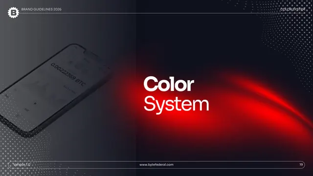
Dark full-bleed divider for Application, with a grayscale phone showing a BTC balance left and a red light-streak behind a bold white title.
Summary
The chapter break into Application: a near-black full-bleed slide with a desaturated phone mockup showing a Bitcoin balance on the left and a red light-streak under a single bold white "Application" title.
Visual description
A dark slide nearly identical to the Color System divider. The left half holds a low, grayscale phone mockup showing "0.00222369 BTC" with a chart and Buy/Sell buttons. The right is near-black with a bright red light-streak arcing across the middle and a large bold white "Application" headline. The header is reversed to white, "APPLICATION" top right; faint halftone dots fill the corners; a rounded pill footer holds version, URL, and page "26."
Key takeaway
Reusing the exact divider treatment for the final chapter keeps the system airtight, the reader instantly knows a new section has started. The recurring app mockup reinforces the product through the dividers without extra explanation.
Reuse notes
Consistent with the other section dividers; use the same template for every chapter break. Repeating one divider layout (rather than designing each uniquely) is a deliberate, reproducible choice that keeps a long deck coherent.