Preview image. Unlock full-res
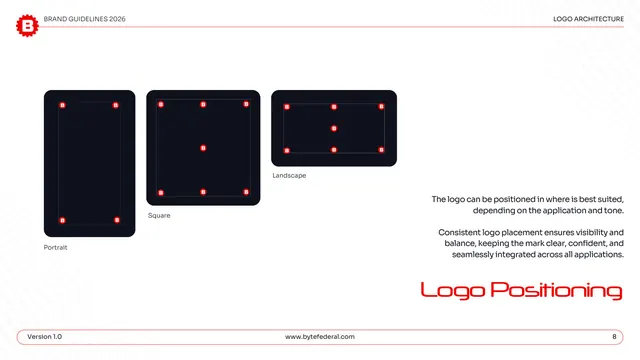
Logo positioning page showing valid placement points for the icon across portrait, square, and landscape dark frames.
Summary
The positioning rules: three dark format frames (portrait, square, landscape) mark the corner and center anchor points where the icon may be placed.
Visual description
White page, "LOGO ARCHITECTURE" header. Three dark rounded frames are labeled Portrait, Square, and Landscape; each shows small red gear-B icons pinned at corners (and center, for square and landscape) to indicate valid placement positions, with thin guide lines connecting them. A right-hand gray note explains the logo can sit wherever best suits the application and tone, and that consistent placement keeps the mark clear and balanced. "Logo Positioning" is set large in red display type lower right; the pill footer shows page "8."
Key takeaway
Mapping allowed logo anchor points per aspect ratio (portrait, square, landscape) gives designers freedom while bounding it, useful for brands shipping into many formats. Showing the marks on dark frames also previews how the icon reads in reverse.
Reuse notes
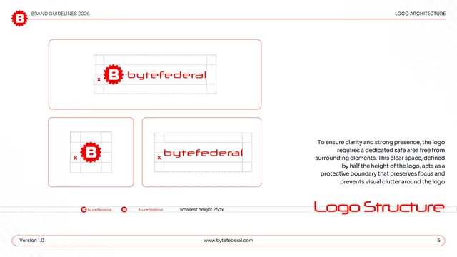
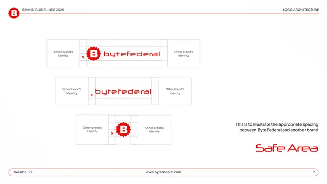
Good for brands that place a mark across varied canvases (social, ads, app screens) and want flexible-but-bounded placement guidance rather than a single fixed corner. Pairs naturally with the safe-area pages that precede it.
From this deck: Byte Federal logo positioning
View deck












More like this






Keep what you find
A free account saves references to boards and can send you a weekly email of picks based on what you save.
To see every result, go Pro.