Preview image. Unlock full-res
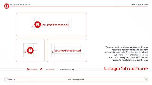
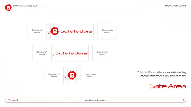
Logo structure page with x-height construction grids, a minimum-size note, and clear-space rules across the three lockups.
Summary
The logo structure rules: construction grids built on an "x" unit show clear space around the primary lockup, the icon, and the wordmark, plus a smallest-height note.
Visual description
White page, "LOGO ARCHITECTURE" header. Three red-outlined cards carry the logos with light dashed grids and an "x" marker indicating the clear-space unit: the primary lockup at top, the icon and wordmark below. A strip near the bottom shows two tiny lockups labeled "smallest height 25px." A right-hand block of centered gray copy explains the logo needs a dedicated safe area defined by half its height to prevent visual clutter. "Logo Structure" sits large in red display type lower right; the pill footer shows page "6."
Key takeaway
Defining clear space as a fraction of the logo's own height ("x") keeps the rule resolution-independent and easy to apply. Pairing the construction grids with an explicit pixel minimum covers both proportion and the practical floor for legibility on one page.
Reuse notes
A reusable safe-area / construction template for any logo with a horizontal lockup, an icon, and a wordmark. Useful whenever a guideline must specify both clear space and minimum size. The dashed grids read clearly on white.
From this deck: Byte Federal logo structure and clear space
View deck
















More like this







Keep what you find
A free account saves references to boards and can send you a weekly email of picks based on what you save.
To see every result, go Pro.