Preview image. Unlock full-res
Caution counterpart to the logo-on-color page, showing low-contrast and tonal mismatches that are not recommended.
Summary
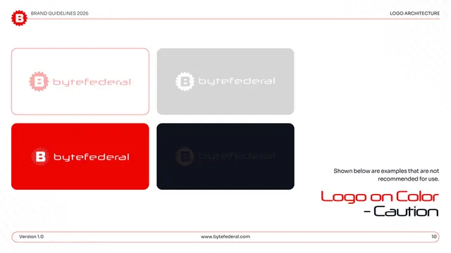
The not-recommended logo-on-color set: the same 2x2 grid as the approved page, but each pairing chosen for poor contrast or tonal clash.
Visual description
White page, "LOGO ARCHITECTURE" header. A two-by-two grid of rounded swatch cards shows weak combinations: a pale pink logo on white, a white logo on light gray, a near-tone red logo on red, and a barely-visible dark logo on near-black. A right-hand gray note reads "Shown below are examples that are not recommended for use." "Logo on Color - Caution" sits large lower right, split across two lines in red and black display type; the pill footer shows page "10."
Key takeaway
Mirroring the approved grid exactly but filling it with bad pairings makes the contrast lesson concrete: readers see the same surfaces fail. Splitting the corner title across red and black lines is a neat way to flag a "caution" variant of an earlier page.
Reuse notes
Use directly after an approved-backgrounds page so the do/don't comparison is one flip apart. A clear teaching device for any brand whose logo gets dropped onto poorly chosen backgrounds. The low-contrast examples deliberately look wrong, which is the point.
From this deck: Byte Federal logo on color - caution
View deck





More like this





Keep what you find
A free account saves references to boards and can send you a weekly email of picks based on what you save.
To see every result, go Pro.