Preview image. Unlock full-res
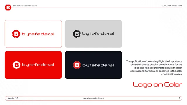
Approved logo-on-color page showing the lockup on white, light gray, red, and dark backgrounds for correct contrast.
Summary
The approved logo-on-color set: the lockup shown correctly on white, light gray, red, and dark backgrounds to demonstrate acceptable contrast pairings.
Visual description
White page under "LOGO ARCHITECTURE." A two-by-two grid of rounded swatch cards shows the logo on different grounds: red-and-black logo on white (red keyline), black logo on light gray, white logo on red, and white logo on near-black. A right-hand gray note stresses careful choice of logo-and-background color combinations for the best contrast and harmony. "Logo on Color" sits large in red display type lower right; the pill footer shows page "9."
Key takeaway
A simple 2x2 of approved background pairings, each using the correct logo color version, communicates the contrast rules faster than text. Including the brand red itself as a background (with the white logo) shows the brand-on-brand case explicitly.
Reuse notes
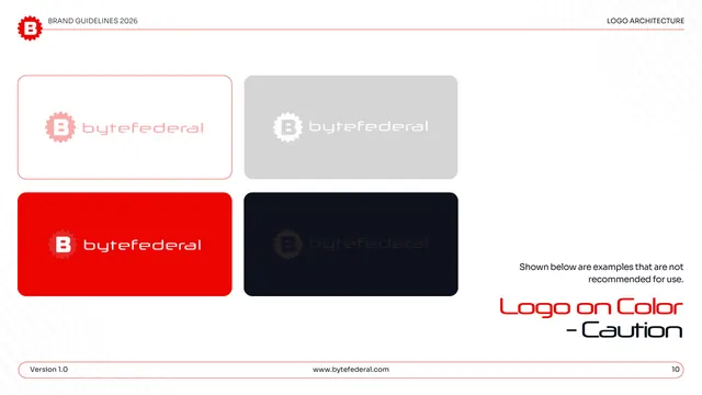
A standard, reusable approved-backgrounds page for any logo with light and dark versions. Pairs directly with a "caution" counterpart page (here, page 10) that shows the same grid done wrong. Keep the swatch set to the brand's real surface colors.
From this deck: Byte Federal logo on color
View deck














More like this








Keep what you find
A free account saves references to boards and can send you a weekly email of picks based on what you save.
To see every result, go Pro.