
Preview image. Unlock full-res
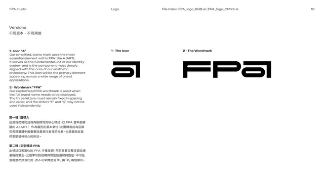
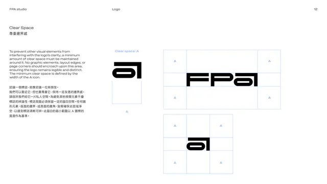
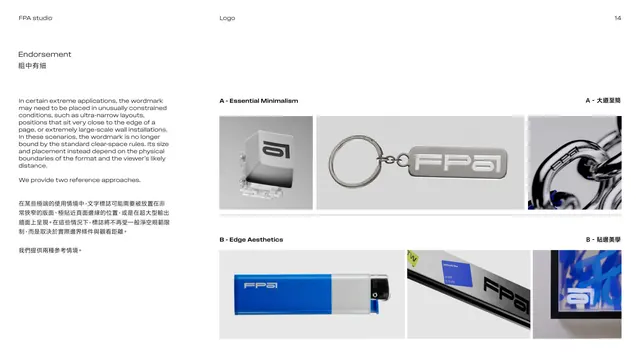
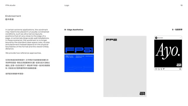
Text page introducing two edge-case logo placement approaches, Essential Minimalism and Edge Aesthetics, for constrained or large-scale uses.
Summary
The endorsement intro: explains that in extreme conditions (ultra-narrow layouts, very large installs, edge placement) the wordmark is freed from clear-space rules, and sets up two reference approaches, "A - Essential Minimalism" and "B - Edge Aesthetics".
Visual description
White, text-only page. The left column gives the rationale in English over Chinese: in constrained or large-scale conditions the mark's size and placement follow the physical format rather than the standard rules, and "We provide two reference approaches." The right side is split into two stacked blocks: "A - Essential Minimalism" describing use over busy or low-resolution contexts, and "B - Edge Aesthetics" describing tight, edge-aligned, high-tension placement, each with a Chinese translation. A hairline separates A from B.
Key takeaway
Naming and codifying the exceptions to clear-space (instead of forbidding them) gives designers permission to be bold while staying intentional. The A / B framing organizes two distinct license cases cleanly.
Reuse notes
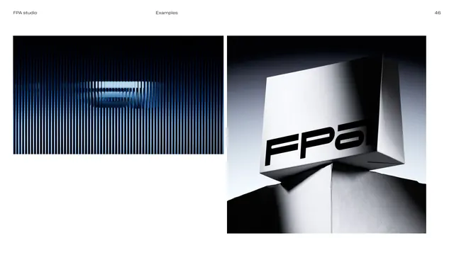
A useful "advanced placement" page for mature identity systems where the logo will live in posters and installations. Pair this text page with visual examples (as the following pages do) so the abstract rules become concrete.
From this deck: Endorsement rules, intro
View deck








More like this



Keep what you find
A free account saves references to boards and can send you a weekly email of picks based on what you save.
To see every result, go Pro.