Preview image. Unlock full-res
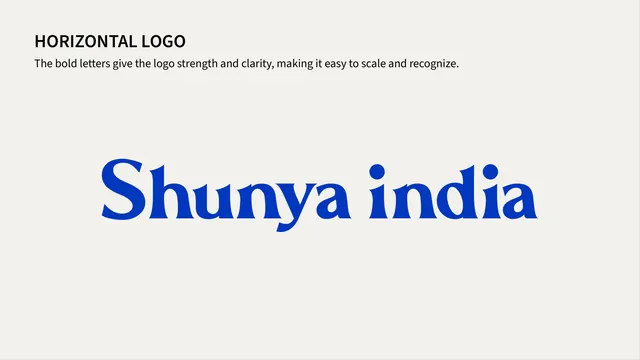
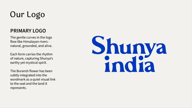
Primary logo reveal page pairing the bold cobalt-blue "Shunya india" wordmark with rationale copy about its curved forms and hidden Buransh flower.
Summary
The primary logo introduction page: a thin serif "Our Logo" heading and three short rationale paragraphs on the left, facing the large stacked cobalt-blue "Shunya india" wordmark on the right.
Visual description
Warm cream background. Top-left carries "Our Logo" in a thin black serif display face, followed by a bold black "PRIMARY LOGO" label in sans-serif small caps. Three short paragraphs beneath explain the logo's curved forms as evoking Himalayan rivers and note that the Buransh flower has been subtly worked into the wordmark. The right two-thirds of the page holds the wordmark itself, stacked in two lines ("Shunya" over "india") in a heavy, rounded cobalt-blue display serif with pronounced curves and dotted lowercase i's, set much larger than any other type on the page.
Key takeaway
Pairing the logo reveal with a short "why it looks this way" rationale, rather than presenting the mark alone, gives the audience a story to repeat when using or defending the logo, and the stacked two-line lockup reads as the brand's default/primary form.
Reuse notes
A clean template for any primary-logo intro page: label plus rationale copy on one side, oversized logo on the other. The rationale copy is short enough that it would not work for a logo with a more complex construction story.
From this deck: Shunya India primary logo reveal
View deck