Preview image. Unlock full-res
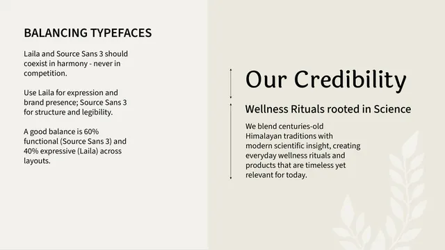
Typeface usage page prescribing a 60/40 split between Source Sans and Laila, with a paired heading-and-body example.
Summary
A typeface-balance page that sets the working ratio between the two faces, 60% functional Source Sans, 40% expressive Laila, with a heading-and-paragraph example using measurement guides.
Visual description
Two-panel layout. The left off-white panel, under an all-caps "BALANCING TYPEFACES" header, gives three short sans-serif rules: the faces should coexist not compete, Laila for expression and Source Sans for legibility, and a 60/40 balance. The right warm-grey panel demonstrates with a large serif heading "Our Credibility", a sans subhead "Wellness Rituals rooted in Science", and a sans body paragraph, with thin vertical measurement arrows bracketing the heading and the text block.
Key takeaway
Quantifying the type pairing as a percentage split and proving it in a live heading/body specimen, the 60/40 rule turns a vague "use both" into an actionable proportion.
Reuse notes
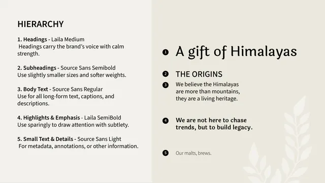
Use after the hierarchy page to govern how the two faces share a layout. Stating a ratio prevents over-decoration with the display face. The measurement arrows reinforce that proportion is being specified, not just shown.
From this deck: Shunya India balancing typefaces
View deck