Preview image. Unlock full-res
Tone-on-tone emerald-green closing page with a faded crest illustration, the cream wordmark, and a designer credit line.
Summary
The deck's final page: a solid emerald-green field carrying a faint tone-on-tone crest illustration at left, the "Shunya india" wordmark top right, and a small designer credit line bottom right.
Visual description
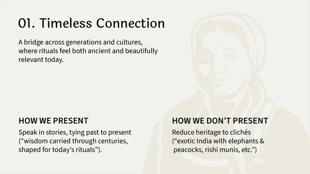
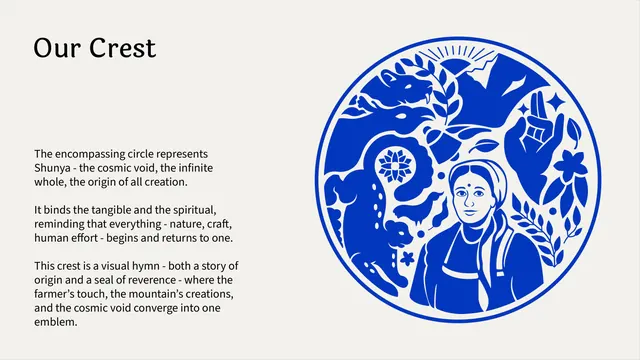
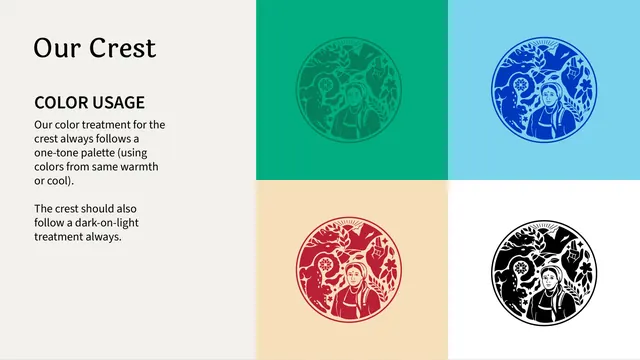
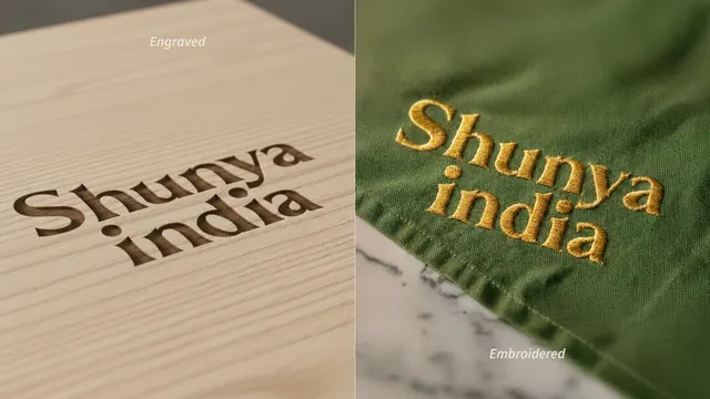
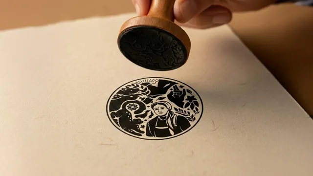
Full-bleed saturated emerald green. The left two-thirds is filled by a large, barely-visible darker-green rendering of the brand's circular crest (the woman's portrait, a raised hand, foliage, and radiating lines), cropped at the page edge. Top right holds the cream-on-green "Shunya india" wordmark in the brand's curvy serif. Bottom right, in small type, an italic line reads "Strategised & Designed by" followed by a regular-weight line reading "Studio Modak in India, 2025."
Key takeaway
Closing the deck on the same tone-on-tone green-and-crest treatment used on the cover bookends the manual visually, and tucking the designer credit into the same quiet corner keeps the closing page from feeling like an afterthought slide.
Reuse notes
A clean, low-key template for ending any brand guideline: reuse the cover's color and crest motif at reduced contrast, then add a one- or two-line studio credit in the corner. Requires a strong single brand color and a graphic mark detailed enough to still read at very low contrast.
From this deck: Shunya India brand guidelines closing page
View deck