Preview image. Unlock full-res
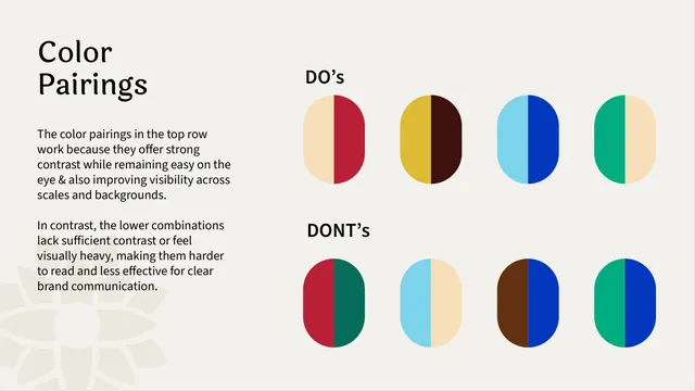
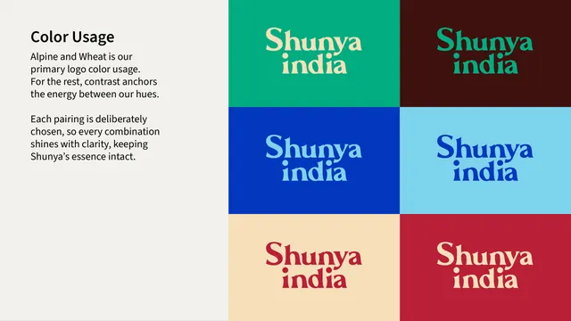
Color-usage page contrasting four approved two-color pairings against four discouraged ones using split capsule swatches.
Summary
A color-pairing page that shows four approved two-tone combinations in a top "DO's" row and four weak combinations in a bottom "DONT's" row, each pairing drawn as a single capsule split down the middle.
Visual description
Off-white background. Left rail carries the serif display title "Color Pairings" and two short sans-serif paragraphs explaining the top row offers strong, easy contrast and the bottom row lacks it. The right two-thirds shows two rows of four vertical capsule shapes; each capsule is split into two brand colors. The DO's row pairs high-contrast combinations (wheat/red, gold/maroon, light-blue/blue, green/wheat); the DONT's row repeats colors with poor contrast (red/green, light-blue/wheat, brown/blue, green/blue).
Key takeaway
Encoding a pairing rule as side-by-side split capsules, putting the good and bad sets in mirrored rows lets a reader judge contrast instantly without reading the rationale.
Reuse notes
Use to govern how brand colors combine, not just which colors exist. The split-capsule do/dont grid is a compact, language-light way to set contrast expectations. Works for any palette with enough colors to mis-pair.
From this deck: Shunya India color pairings do's and don'ts
View deck

















































More like this



Keep what you find
A free account saves references to boards and can send you a weekly email of picks based on what you save.
To see every result, go Pro.