Preview image. Unlock full-res
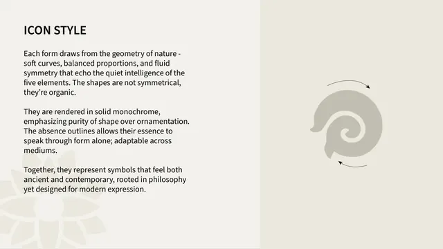
Iconography page describing the icon design language, organic solid monochrome forms, beside one enlarged element glyph with motion arrows.
Summary
An icon-style page that articulates the drawing principles, organic asymmetric forms, solid monochrome fills, no outlines, illustrated by one element glyph blown up large with curved motion arrows.
Visual description
Two-panel layout. The left off-white panel, under an all-caps "ICON STYLE" header, gives three short sans-serif paragraphs: forms drawn from the geometry of nature and deliberately not symmetrical; rendered in solid monochrome with no outlines; meant to feel both ancient and contemporary. The right warm-grey panel shows a single enlarged grey element icon (a spiral/swirl form) flanked by two thin hand-drawn curved arrows suggesting rotation.
Key takeaway
Stating an icon philosophy in plain principles (organic, solid, outline-free) and proving it by enlarging one glyph so the construction logic is legible, the motion arrows hint the forms have implied flow.
Reuse notes
Use right after the icon set to lock the drawing rules before the usage specs. Blowing up a single icon is an effective way to show internal detail and stroke logic. Pairs with a following clearspace/sizing page.
From this deck: Shunya India icon style principles
View deck



















More like this


Keep what you find
A free account saves references to boards and can send you a weekly email of picks based on what you save.
To see every result, go Pro.