Preview image. Unlock full-res
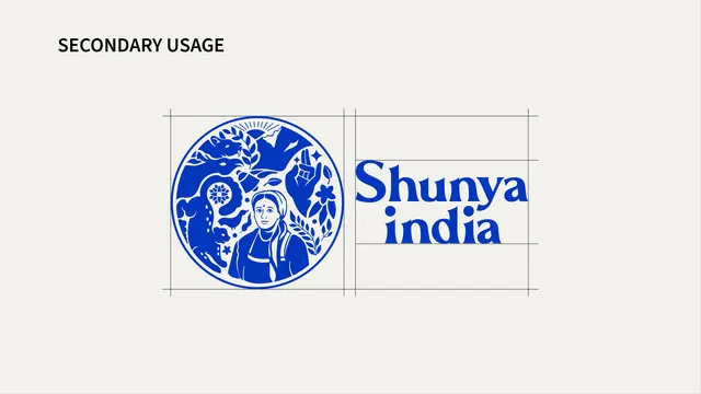
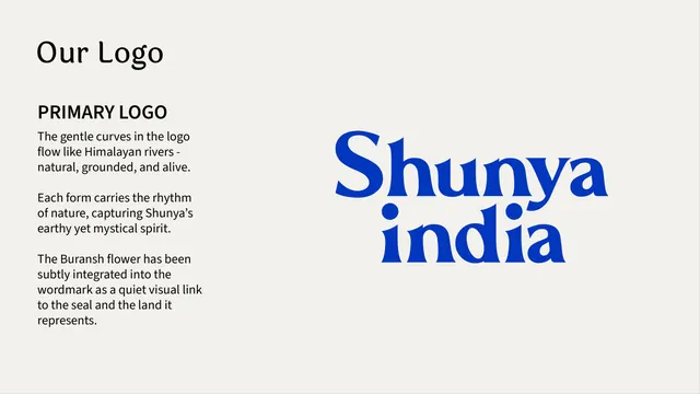
Logo page showing the blue crest beside the Shunya India serif logotype in a horizontal lockup with alignment guides.
Summary
The secondary logo lockup: the same cosmic-blue crest placed to the left of the serif "Shunya india" logotype in a horizontal arrangement, with construction guides.
Visual description
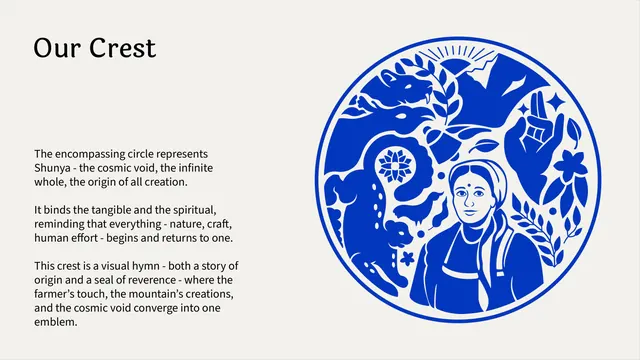
Off-white background, a small all-caps "SECONDARY USAGE" label at top-left. Centered on the page is the horizontal lockup, the detailed circular crest in cosmic blue on the left, a vertical divider guide, then the two-line serif logotype in matching blue on the right. Thin rectangular guides bracket both elements to define spacing and the gap between mark and type.
Key takeaway
Offering a horizontal alternate to the stacked primary lockup so the identity can flex into wide spaces (headers, signage) while keeping the exact same mark, color and proportional logic.
Reuse notes
Pair directly after a vertical primary lockup. Use the horizontal form where width is plentiful and height is limited. The shared color and construction guides keep the two lockups visibly part of one system.
From this deck: Shunya India secondary horizontal logo lockup
View deck












More like this


Keep what you find
A free account saves references to boards and can send you a weekly email of picks based on what you save.
To see every result, go Pro.