Preview image. Unlock full-res
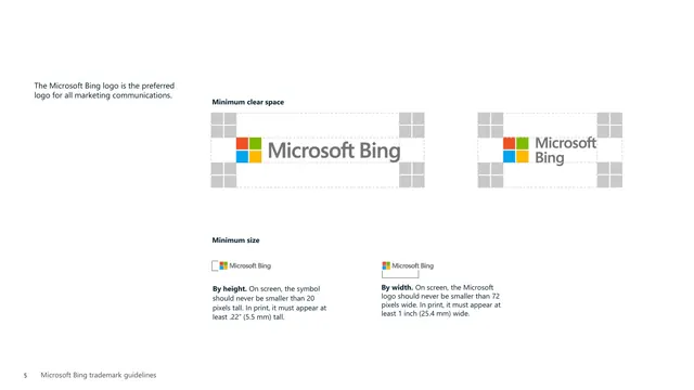
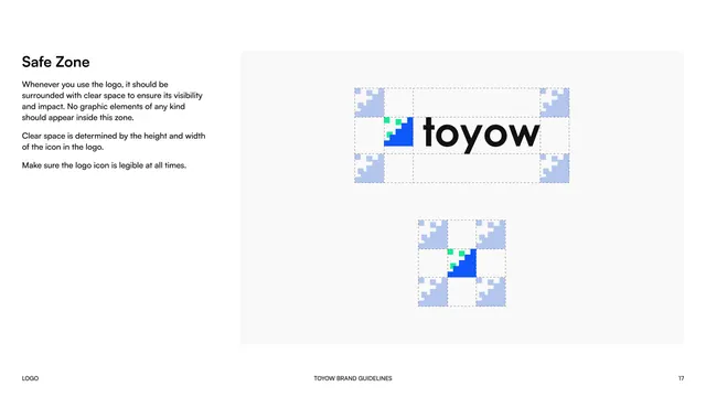
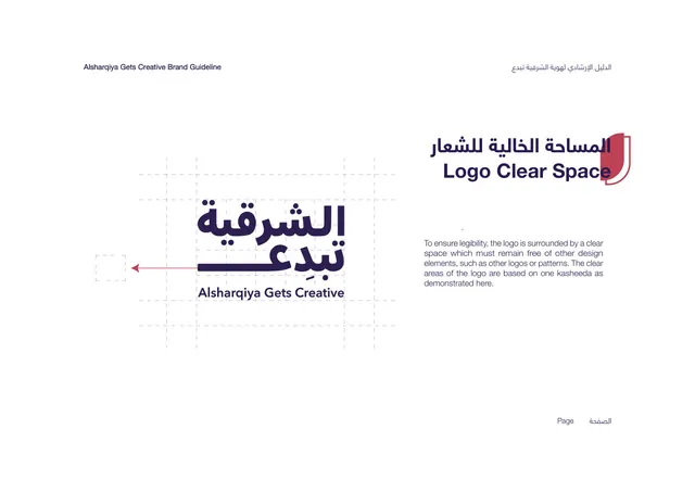
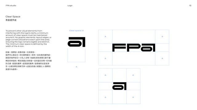
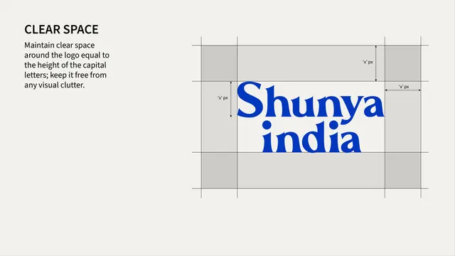
Clear-space specification page showing the wordmark inside a measured grid with gray exclusion-zone bands labeled in x-units.
Summary
A technical clear-space diagram defining the minimum protected margin around the wordmark, measured against the height of its capital letters.
Visual description
Cream background. Top-left holds a bold black "CLEAR SPACE" label and a short instruction: maintain clear space equal to the height of the capital letters, kept free of clutter. On the right, the stacked blue wordmark sits inside a ruled grid: thin black guide lines mark a bounding box around the logo, with light-gray shaded bands on all four sides representing the exclusion zone, each labeled "'x' px" with small arrow-tipped measurement lines indicating the unit is derived from the logo's own capital-letter height.
Key takeaway
Defining the clear-space unit as a multiple of the logo's own letterforms (an "x" unit tied to cap height) rather than a fixed pixel value keeps the rule scale-independent across any application size.
Reuse notes
Standard, reusable diagram format for any logo clear-space rule. The gray-band-plus-arrow convention shown here is easy to replicate for other measurement specs in the same guideline (grid, minimum size, and so on).
From this deck: Shunya India logo clear space spec
View deck