Preview image. Unlock full-res
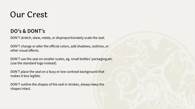
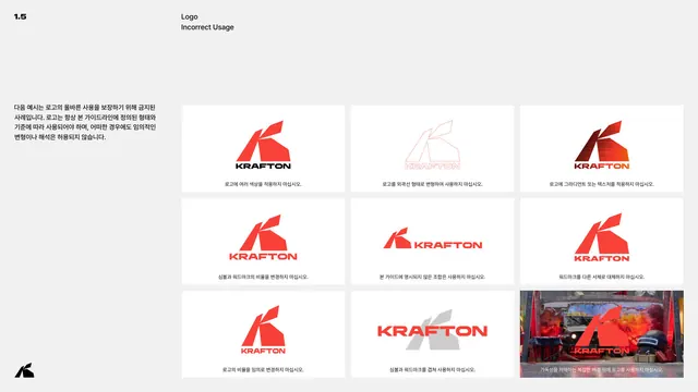
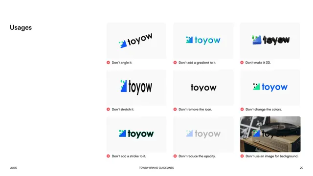
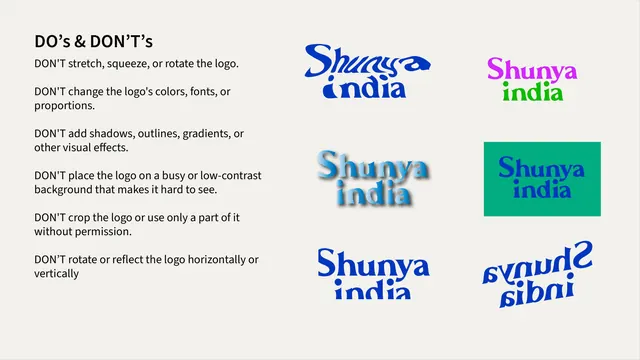
Logo misuse page pairing a bulleted list of six "don't" rules with six broken example lockups showing distortion, recoloring, gradients, and mirroring.
Summary
A "DO's & DON'T's" spread listing six logo-usage rules on the left, illustrated by six matching broken examples of the wordmark on the right.
Visual description
Cream background. Left third lists six "DON'T" rules in black sans-serif: don't stretch/squeeze/rotate, don't change colors/fonts/proportions, don't add shadows/outlines/gradients, don't place on busy or low-contrast backgrounds, don't crop or use only part of the logo, don't mirror or reflect it. The right two-thirds shows six corresponding broken lockups in a loose 2x3 arrangement with no background tiles: a warped/skewed blue wordmark, a magenta-and-green recolored version, a blue-to-white gradient version with a drop shadow, a small blue-on-teal version cramped into a filled rectangle (low contrast/cropped feel), a squeezed/condensed blue version, and a fully mirrored (upside-down and flipped) blue version.
Key takeaway
Illustrating every written rule with its own dedicated broken example, in the same order as the text list, removes any ambiguity about what each rule actually means in practice.
Reuse notes
Standard, highly reusable "misuse" page format for any logo guideline. Requires generating one deliberately-wrong version of the logo per rule, which is more production effort than a text-only rules list but removes far more ambiguity for whoever applies the brand later.
From this deck: Shunya India logo dos and don'ts
View deck