Preview image. Unlock full-res
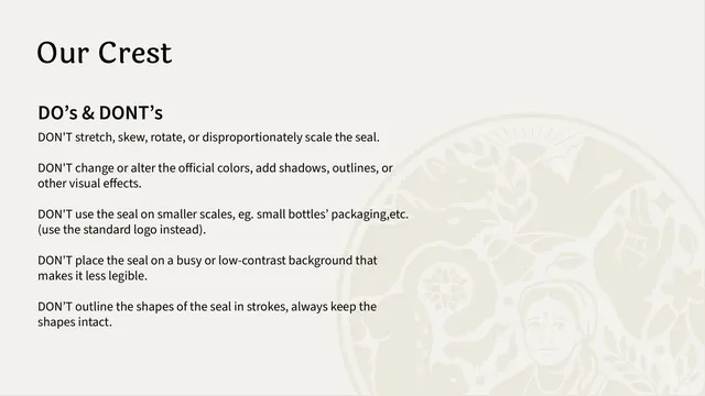
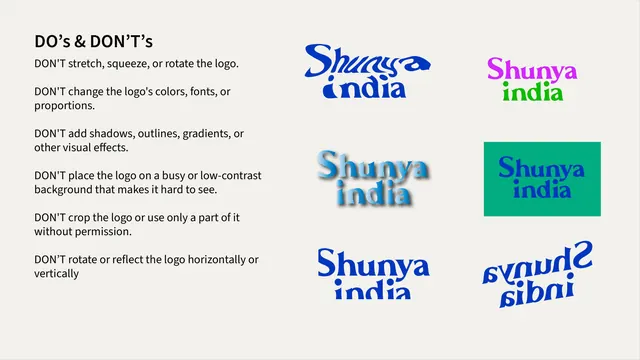
Logo misuse page listing five DON'T rules for the crest over a large faint watermark of the seal itself.
Summary
A logo do's-and-don'ts page that lists five DON'T rules for the crest as a bulleted column, with the seal itself ghosted huge and pale behind the text.
Visual description
Off-white background. The serif title "Our Crest" sits top-left, a bold "DO's & DONT's" subhead below it, then five short DON'T statements in sans-serif (no stretching, no color changes, no tiny-scale use, no busy backgrounds, no outlining the shapes). Filling the right and lower portion of the page is a very low-contrast oversized rendering of the crest in a barely-darker tone of the background, acting as a watermark.
Key takeaway
Using the asset under discussion as its own faint backdrop, the ghosted crest fills dead space and reinforces what the rules protect without competing with the copy.
Reuse notes
Standard misuse page for any identity. The ghost-watermark trick is a clean way to fill a copy-light page. Keep the watermark contrast extremely low so the rules stay the focus.
From this deck: Shunya India crest do's and don'ts
View deck






























More like this




Keep what you find
A free account saves references to boards and can send you a weekly email of picks based on what you save.
To see every result, go Pro.