Preview image. Unlock full-res
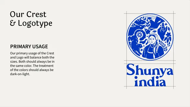
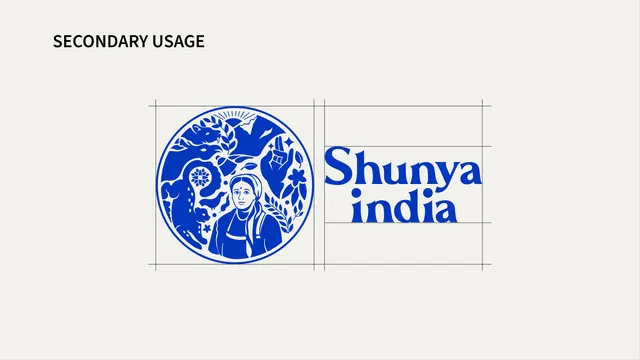
Horizontal lockup spec page showing the "Shunya india" wordmark set on a single baseline with a short usage note.
Summary
A dedicated spec page for the alternate horizontal lockup, showing "Shunya india" set on one baseline instead of the stacked default.
Visual description
Cream background, minimal layout. Top-left holds a bold black sans-serif label "HORIZONTAL LOGO" followed by one line of smaller sans-serif body copy: "The bold letters give the logo strength and clarity, making it easy to scale and recognize." Centered in the lower two-thirds of the frame, the cobalt-blue wordmark is set as a single horizontal line, "Shunya india," in the same rounded display serif used elsewhere, noticeably wider and flatter in proportion than the stacked version.
Key takeaway
Documenting the horizontal variant on its own page, separate from the primary stacked mark, makes clear it is a sanctioned alternate rather than an improvised resize, and the short one-line rationale keeps the justification for its existence explicit.
Reuse notes
Useful reference for any brand offering a horizontal alternate to a stacked wordmark, particularly for narrow placements like a website header or a single-line packaging band.
From this deck: Shunya India horizontal logo lockup
View deck