Preview image. Unlock full-res
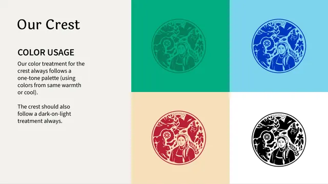
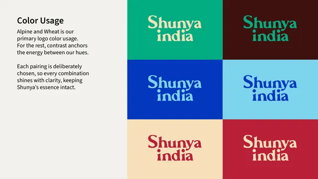
Logo color-usage page showing the "Shunya india" wordmark in six approved color combinations across a 2x3 grid of brand-colored backgrounds.
Summary
A color-usage reference showing six approved background-and-wordmark color pairings arranged in a 2x3 grid, all using the same stacked logo lockup.
Visual description
Left third of the page is cream with a bold black "Color Usage" heading and two short paragraphs noting that "Alpine and Wheat" is the primary color usage and that contrast anchors every other pairing. The right two-thirds is filled edge-to-edge by a borderless 2-column, 3-row grid of solid-color tiles, each holding the stacked wordmark in a contrasting color: cream-on-emerald-green, emerald-on-dark-maroon, light-blue-on-cobalt-blue, cobalt-blue-on-sky-blue, crimson-on-wheat/tan, and cream-on-crimson.
Key takeaway
Presenting every sanctioned color pairing as a single grid of filled tiles, with no logo left unpaired or shown in isolation, makes it unambiguous which combinations are approved and which are not implicitly allowed.
Reuse notes
Directly reusable template for any brand with several sanctioned two-color logo treatments. Works best when the brand palette itself has enough range (here: green, maroon, cobalt, sky blue, wheat, red) to make each tile visually distinct.
From this deck: Shunya India logo color usage grid
View deck