Preview image. Unlock full-res
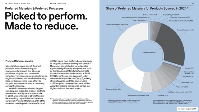
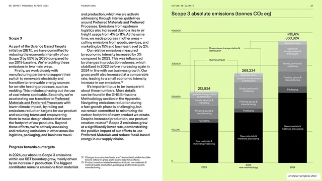
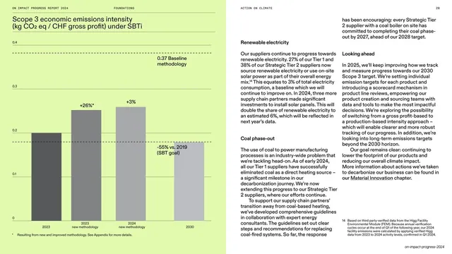
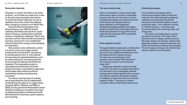
Split spread pairing a left text column with a large labelled donut chart of preferred-material share on a pale-blue panel.
Summary
A two-panel spread: a white left half with a big "Picked to perform. Made to reduce." headline over two columns of body copy, and a pale-blue right half holding a large labelled donut chart of material share.
Visual description
The slide splits vertically. The left white panel runs a tiny all-caps running header ("ON IMPACT PROGRESS REPORT 2024" / "MATERIAL INNOVATION"), an oversized two-line black headline "Picked to perform. Made to reduce.", and a "Preferred Materials sourcing" subhead above two narrow columns of justified body text. The right panel is a soft blue field titled "Share of Preferred Materials for Products Sourced in 2024" and dominated by a large grey-and-white donut chart whose many slices are leader-lined out to percentage labels (Ethylene-Vinyl Acetate foam 32.1%, Recycled Polyester 24.2%, Synthetic Rubber 14.8%, and a long tail of sub-5% materials), with a "Preferred Materials" core label and two footnote blocks below.
Key takeaway
Splitting a data slide into a calm text argument on one side and a single dense chart on the other, with a flat color shift (white to pale blue) doing all the separation. The donut with exhaustive leader-lined labels packs a full material breakdown into one readable ring.
Reuse notes
A strong template for sustainability or operational reports that must show a full categorical breakdown without a table. Needs a chart engine that can place many leader lines cleanly; with too many tiny slices the labels crowd. Reuse the two-tone split for any "narrative + evidence" pairing.
From this deck: Preferred materials share donut chart
View deck
















More like this







Keep what you find
A free account saves references to boards and can send you a weekly email of picks based on what you save.
To see every result, go Pro.