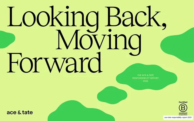
Preview image. Unlock full-res
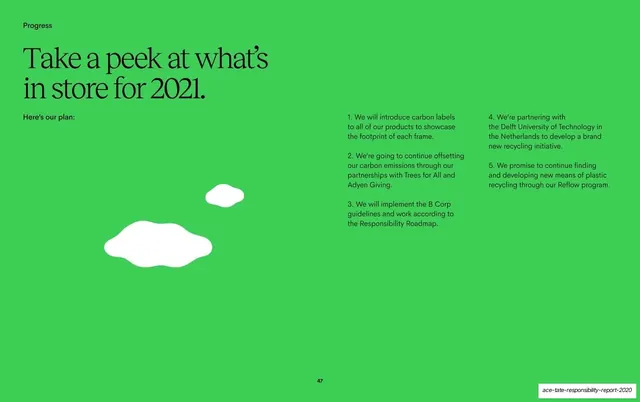
A 49-page sustainability report that pairs an oversized high-contrast serif with a bold sans, runs on a chartreuse / forest-green / mauve palette, and uses organic blob and wave shapes plus flat illustrations to keep dense impact data warm and editorial.
Summary
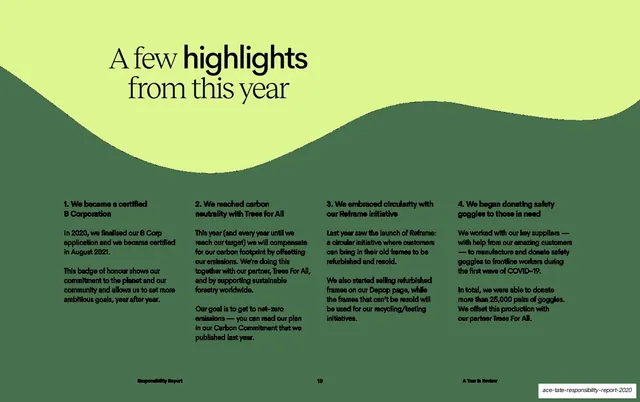
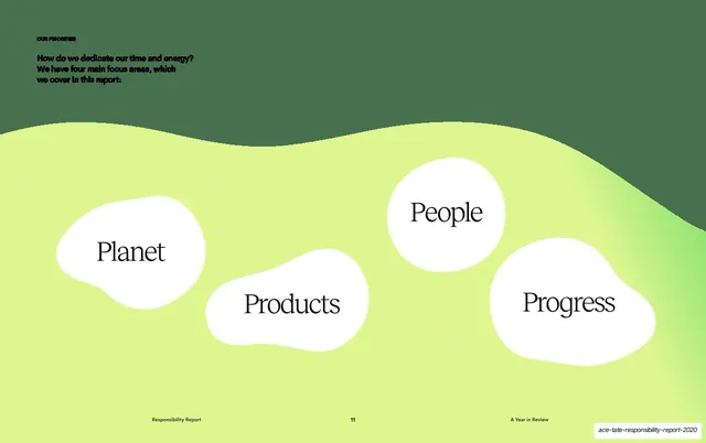
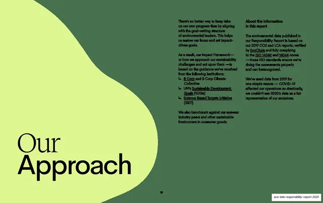
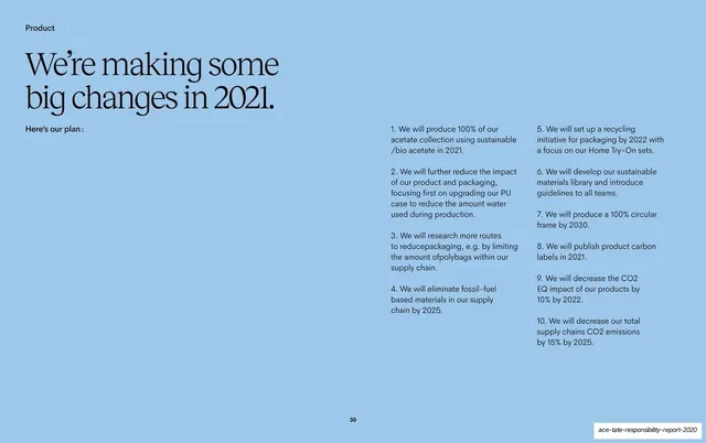
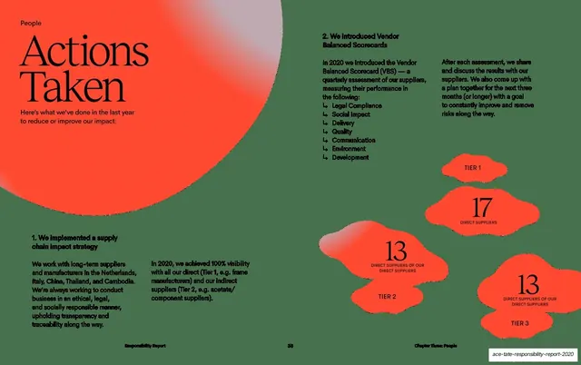
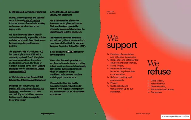
The 2020 Responsibility Report for eyewear brand Ace & Tate: a 49-page sustainability and impact report structured as a founder letter, a year-in-review, a methodology section, and four themed chapters (Planet, Products and Packaging, People, Progress). Its personality comes from one oversized high-contrast serif paired with a bold sans for emphasis words, a chartreuse-and-forest-green base, per-chapter accent colors, and organic blob, wave, and flat-illustration motifs that keep heavy impact data feeling warm and editorial.
Visual description
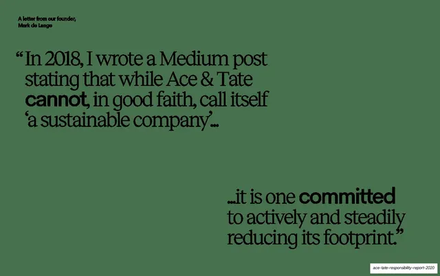
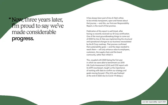
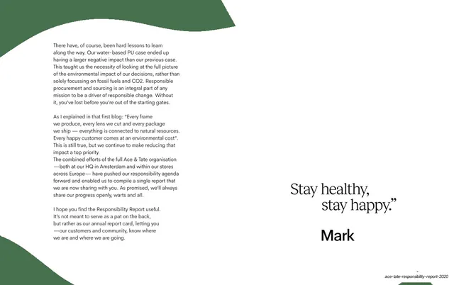
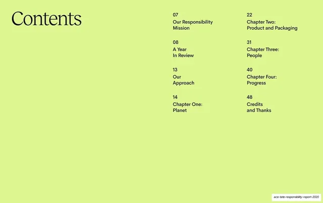
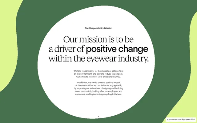
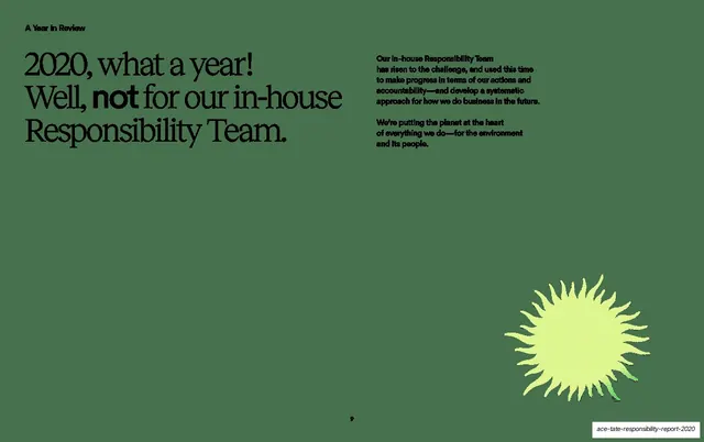
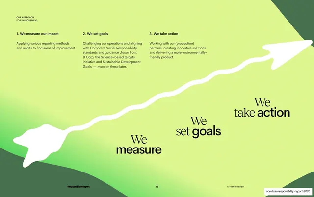
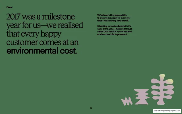
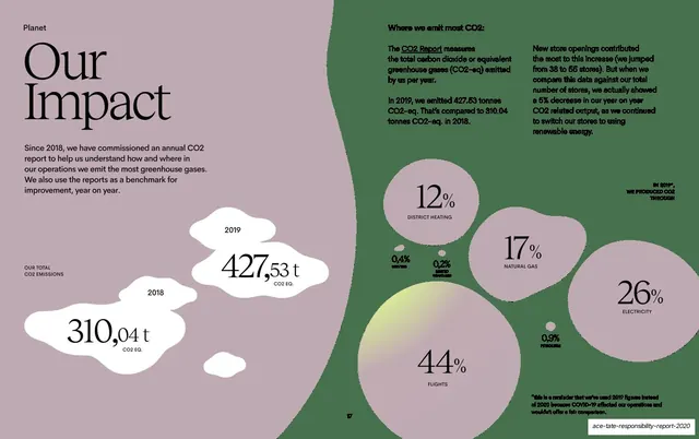
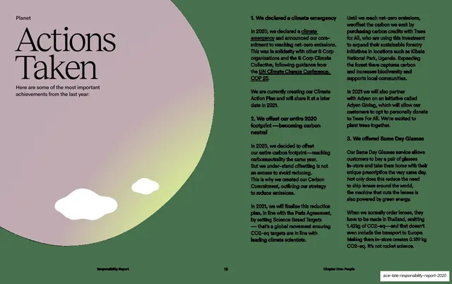
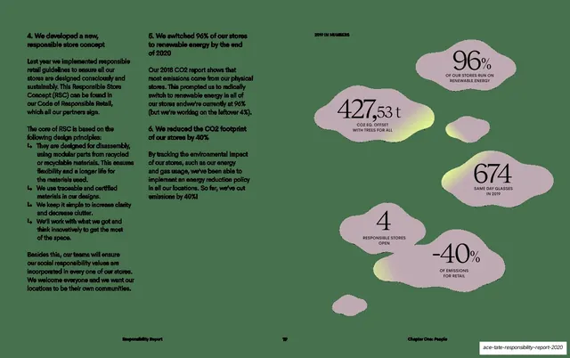
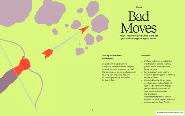
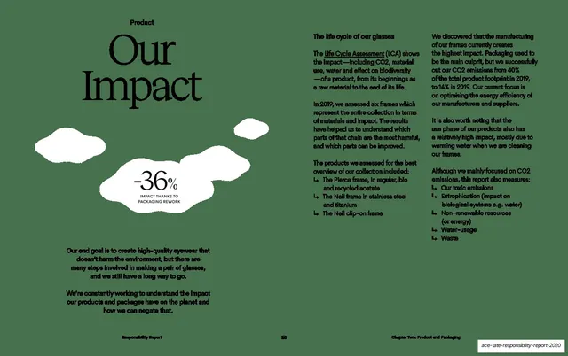
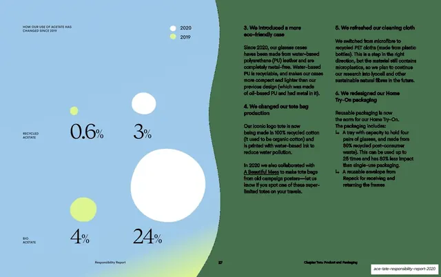
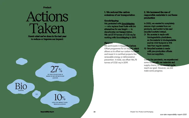
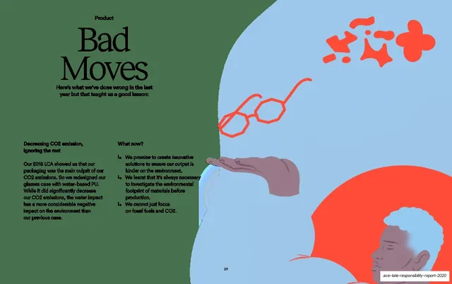
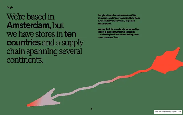
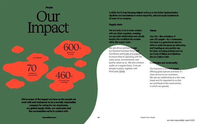
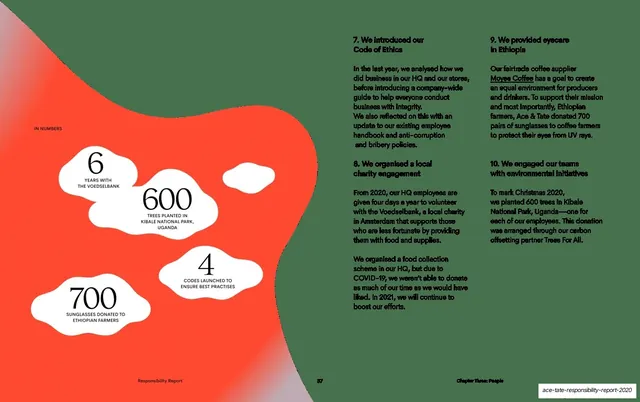
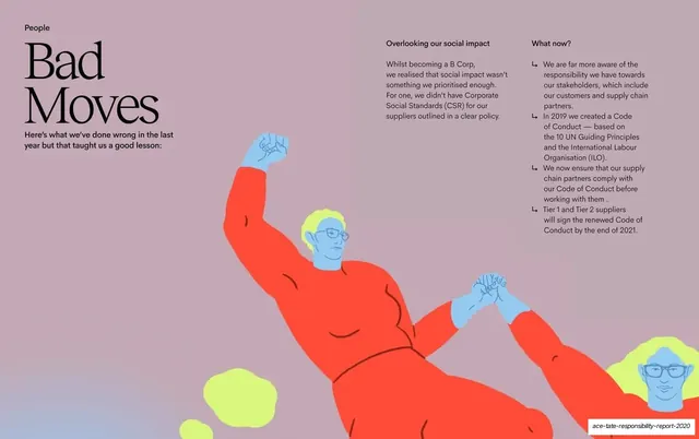
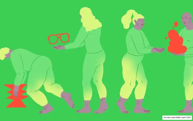
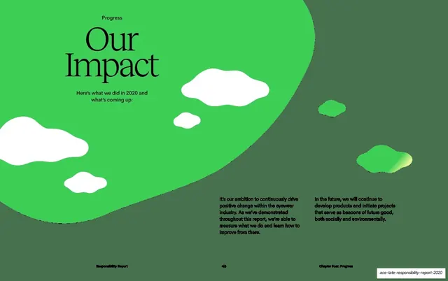
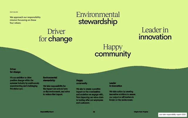
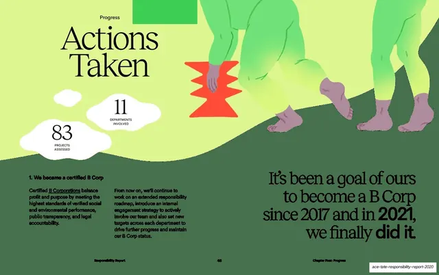
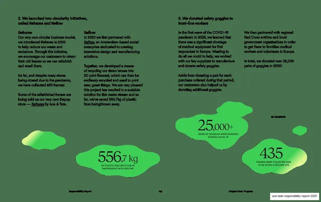
Pages are 16:9. The base palette alternates a bright chartreuse/lime (#D8F08A), a deep muted forest green (#4A5C44), and clean white, with each chapter introducing its own accent: a dusty mauve/lilac (#C4ABB6) for Planet, and further colors deeper in the report. Type pairs a single oversized high-contrast serif (a Didone-style display, used for chapter titles, statements, and headings, almost always left-aligned and set very large) with a clean sans-serif for body copy and for bolded emphasis words dropped inside the serif sentences. Organic, hand-drawn shapes are the signature device and appear in every form: scattered blobs on the cover, sweeping waves framing text spreads, large white blobs used as content containers on dark fields, small plant and sun motifs in empty corners, and a rising hand-drawn arrow used to diagram a process. Flat vector illustrations in a tightly limited palette (lime, red, mauve, pale blue) appear as occasional full-bleed beats and as the image half of letter spreads. Recurring layouts: oversized-serif chapter openers with one organic shape and a "Chapter X" label; statement slides with a big serif claim plus tight supporting copy and a corner motif; two- and three- and four-column body grids led by bold numbered headings; a contents page with green page numbers; and data pages that render emissions as sized blobs and percentage bubbles rather than bar charts. Running headers and footers ("Responsibility Report" / chapter name / centered page number) and a B Corp certification seal anchor the system.
Key takeaway
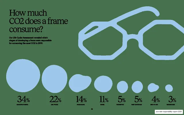
The core move is making a dense, data-heavy sustainability report feel warm and human: an oversized editorial serif carries authority, a bold sans highlights the single takeaway in each statement, and organic blob/wave shapes plus flat illustrations soften every spread. The strongest specific ideas are using soft organic blobs as content containers and as data shapes (turning CO2 figures into sized bubbles instead of charts), and giving each chapter its own background color while keeping one fixed opener template so variety and consistency coexist. The alternating lime / dark-green / white rhythm paces a long document without any decoration.
Reuse notes
A reference for any sustainability, ESG, impact, or annual report, and for long-form editorial decks that must stay legible and on-brand across dozens of pages. The chapter-opener system (oversized serif title, one organic shape, chapter label, distinct color), the statement-slide grammar (serif claim with one bolded sans phrase plus a corner motif), and the organic data treatment are all directly reusable. It depends on a strong high-contrast serif and on commissioned flat illustrations and shapes in a tight palette; swap stock art in and the cohesion breaks. The B Corp seal and the four named chapters are specific to Ace & Tate.
From this deck: Ace & Tate Responsibility Report 2020
View deck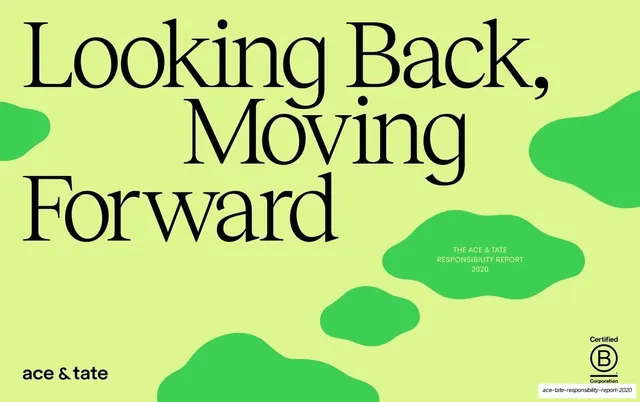







More like this






Keep what you find
A free account saves references to boards and can send you a weekly email of picks based on what you save.
To see every result, go Pro.