Preview image. Unlock full-res
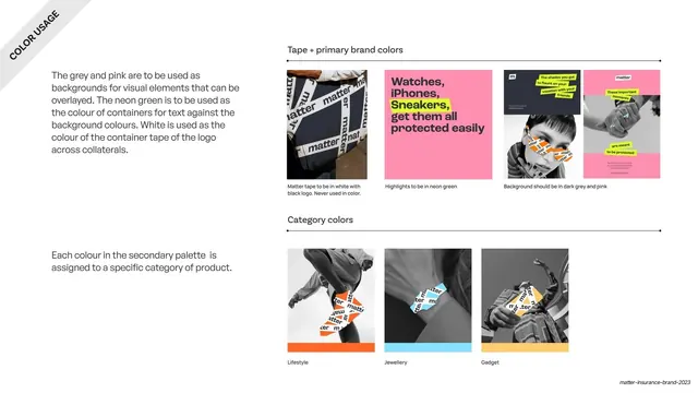
Color-application page showing how tape, highlights and backgrounds use the primary colors, plus secondary colors assigned to product categories.
Summary
The color-in-use page: a top row showing how the primary colors behave (tape white, highlights neon green, backgrounds grey and pink) and a bottom row assigning each secondary color to a product category over black-and-white photos.
Visual description
A white full-bleed slide with a rotated "COLOR USAGE" ribbon in the top-left corner and two left-hand body blocks. The top right, under "Tape + primary brand colors", shows four small example cards: a real photo of white "matter" tape, a pink card with a neon-green highlighted headline, and two grey/pink social mockups, each captioned with its rule. The bottom right, under "Category colors", shows three black-and-white lifestyle photos (a skater, a wrist with jewellery, a person with a bag) each with the brand tape composited on and a thin color bar beneath, labelled "Lifestyle" (orange), "Jewellery" (blue) and "Gadget" (yellow), demonstrating the secondary palette as a category coding system.
Key takeaway
Assigning each secondary color to a named product category and proving it on real photography, so color becomes a wayfinding system across the product range. Pairing every rule with a live example rather than a swatch makes the abstractions concrete.
Reuse notes
A strong template for brands with multiple product lines or categories that need color-coding. The "rule plus example card" grid is reusable for any color-application page. Depends on consistent photography and the tape device to tie the examples together.
From this deck: Color usage and category color-coding
View deck









More like this



Keep what you find
A free account saves references to boards and can send you a weekly email of picks based on what you save.
To see every result, go Pro.