Preview image. Unlock full-res
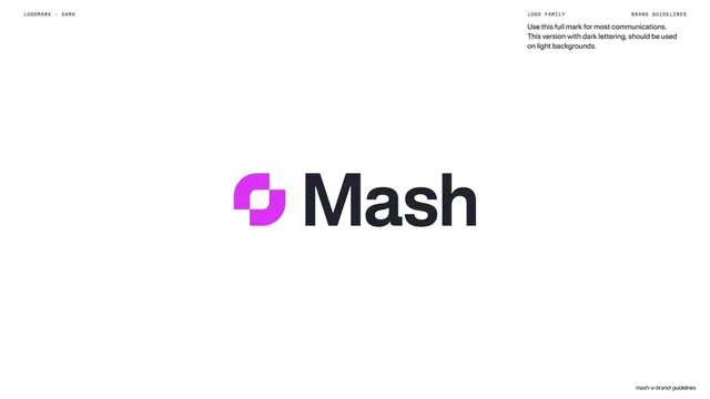
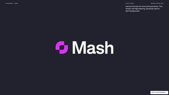
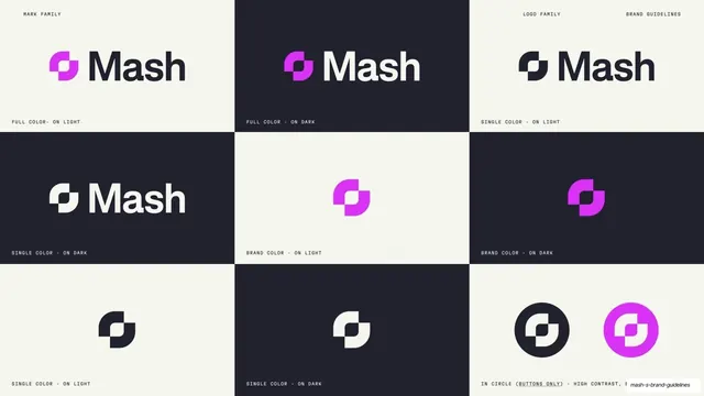
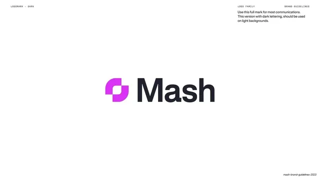
White slide showing the full Mash lockup with the magenta mark and dark "Mash" wordmark, for use on light backgrounds.
Summary
The primary lockup page for light backgrounds: the full Mash mark centered, magenta graphic mark plus dark "Mash" wordmark, with a short usage note at top-right.
Visual description
White (slightly warm) background. The full lockup is centered large: the gradient-magenta interlocking graphic mark on the left, beside the "Mash" wordmark in a bold near-black neo-grotesque sans. A mono header sits at top: "LOGOMARK - DARK" upper-left, "LOGO FAMILY" / "BRAND GUIDELINES" upper-right. A short usage note in dark text at upper-right reads that this full mark is for most communications and this dark-lettering version should be used on light backgrounds. Wide empty space surrounds the lockup.
Key takeaway
The plainest possible primary-logo page: mark centered large, one short usage note, nothing else. It makes the correct default lockup unmissable and gives the magenta mark room to be the only color on the page.
Reuse notes
The canonical "here is the primary logo on light" page for any brand book. Keep it paired with its dark-background twin (the next page) so the two background rules sit together. Generous margins are doing real work; do not crowd the mark with specs.
From this deck: Full mark, dark lettering on light
View deck

















More like this




Keep what you find
A free account saves references to boards and can send you a weekly email of picks based on what you save.
To see every result, go Pro.