Preview image. Unlock full-res
Four-zone report page combining partnership body copy, an oversized pull quote, a worker photo, and outline display type bleeding off the right edge.
Summary
A partnership page that balances dense body copy against an oversized attributed pull quote, a small worker photo, and giant outline lettering running up the right edge. The mix of tiny utility text and billboard quote is its signature.
Visual description
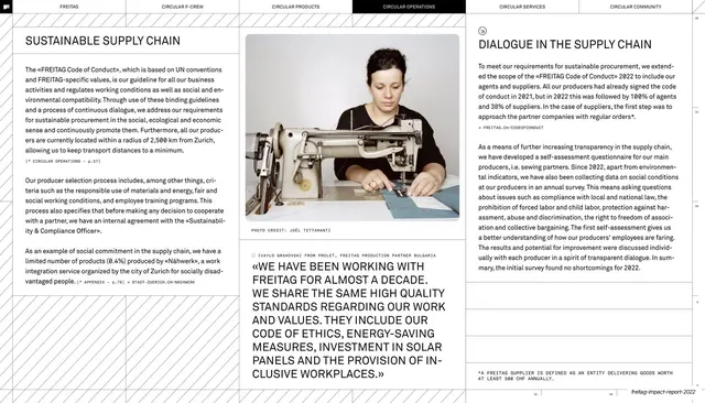
White page, six-chapter top nav with "CIRCULAR COMMUNITY" filled black. The left column heads "DEVELOPMENT PARTNERSHIPS & COLLABORATIONS" with a "CIRC-CASE" subhead and arrow-bulleted body items in small type. The center column opens with an oversized quotation set in heavy type, "DURING THE INTENSIVE DEVELOPMENT PERIOD, THE SHORT DISTANCES IN PRODUCTION AND PROXIMITY TO OUR PARTNERS WERE A BIG PLUS", attributed in small caps to a named product driver, followed by body copy and a "THE CIRCULAR TARP" subhead. On the right, large outline display letters ("IE KREISLAUFFAHIG", a partial phrase) bleed off the edge, with a small photograph of a worker and a "PHOTO CREDIT" caption tucked beside it. Thin column rules, a vertical spine label, and the running footer complete the frame.
Key takeaway
Running an oversized attributed quote as the emotional center of an otherwise factual page. The partial outline phrase bleeding off the right edge adds graphic energy and depth without a full image, using type itself as texture.
Reuse notes
Reach for this on testimonial-adjacent or partnership pages where a single quote should carry the page over the surrounding data. The off-edge outline type is a cheap way to add scale; keep it as a fragment so it reads as texture, not a headline to be read in full.
From this deck: Development partnerships and collaborations
View deck