Preview image. Unlock full-res
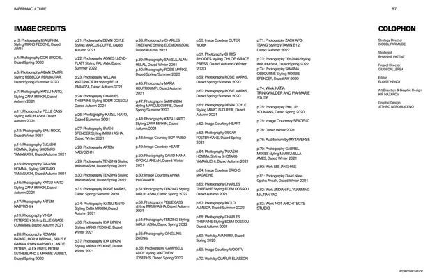
An 89-page Dazed x SPACE10 research report on how Gen Z defines home, set in a stark black-white-and-baby-pink editorial system with oblique bold display type, pill-shaped section labels, and full-bleed fashion photography.
Summary
An 89-page editorial research report by Dazed Media and SPACE10 on how 18-24 year olds define and experience home. Its design system is a tight black, white, and baby-pink palette married to oblique bold grotesque headlines, pill-shaped capsule labels, and full-bleed Dazed fashion photography, reading like a magazine feature rather than a slide deck.
Visual description
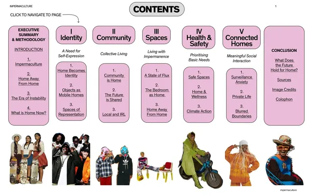
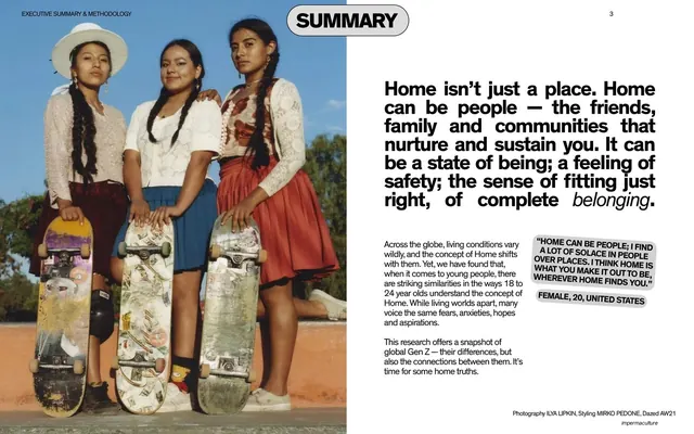
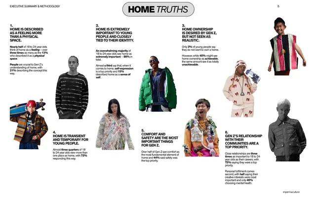
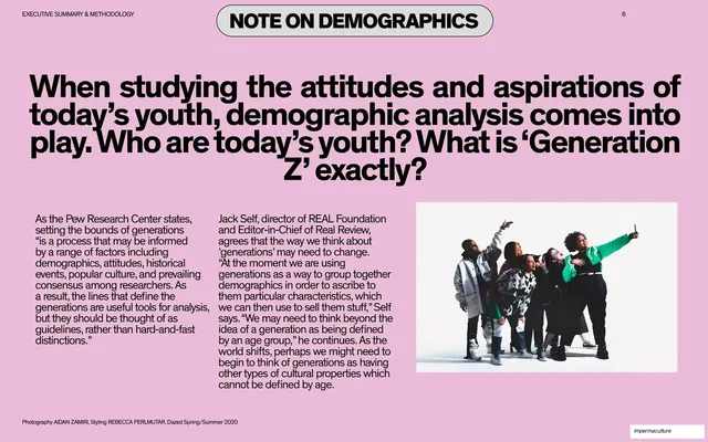
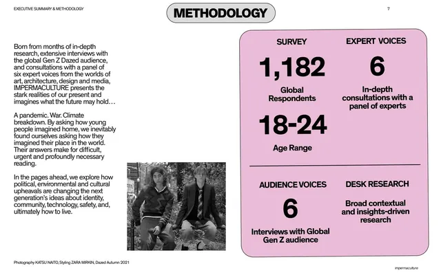
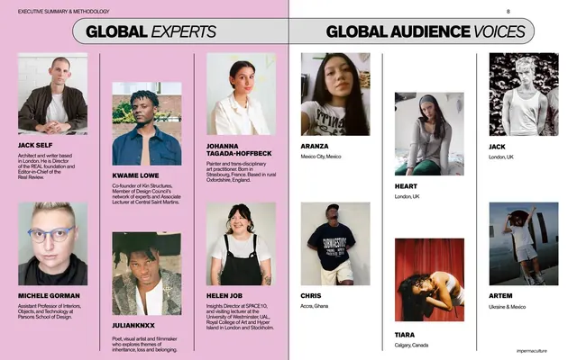
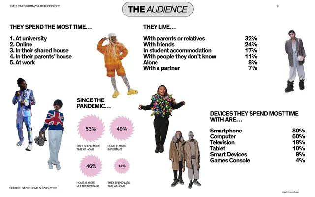
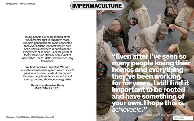
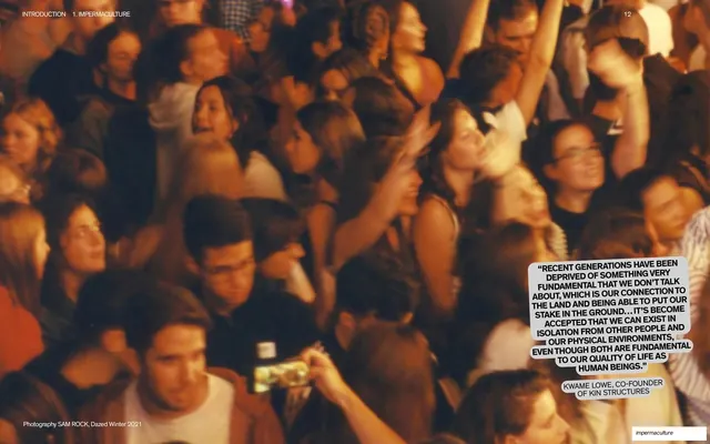
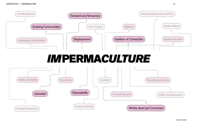
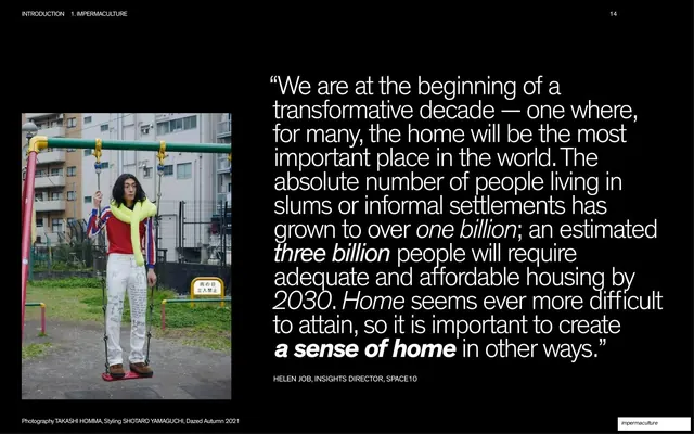
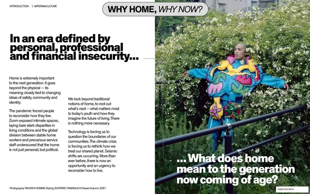
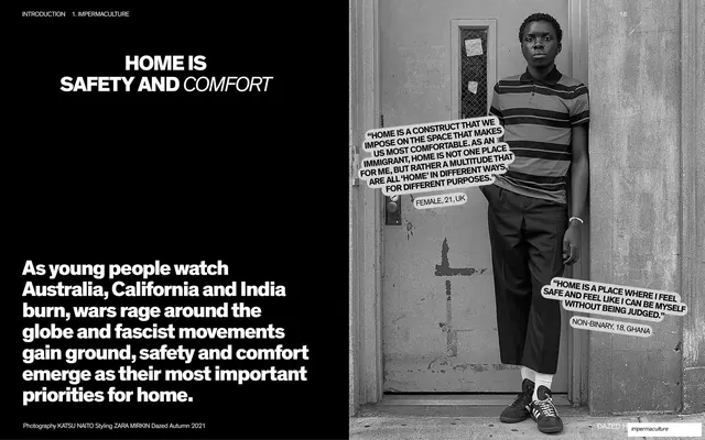
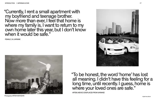
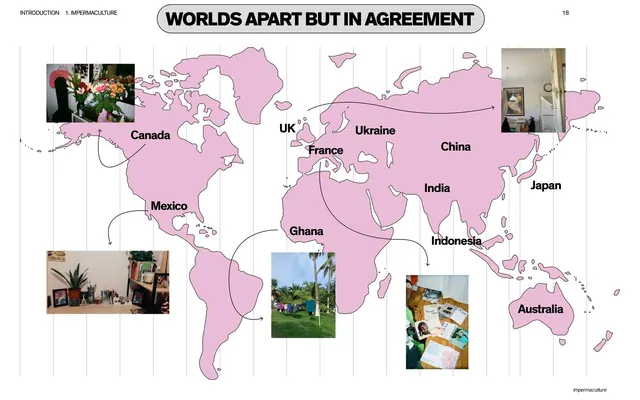
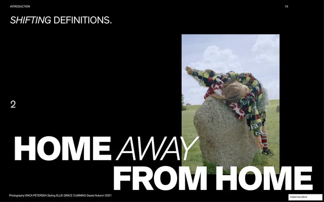
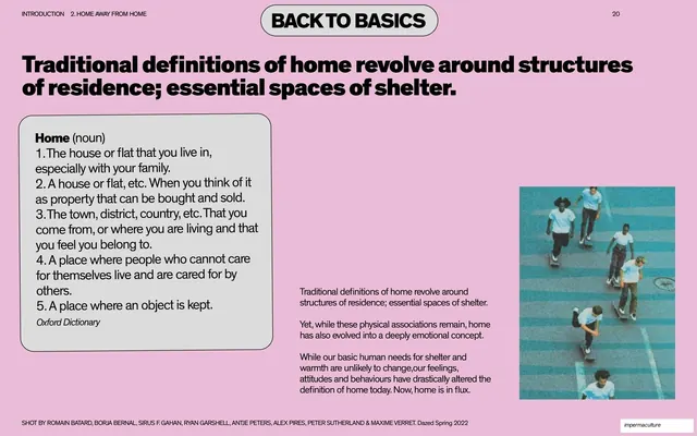
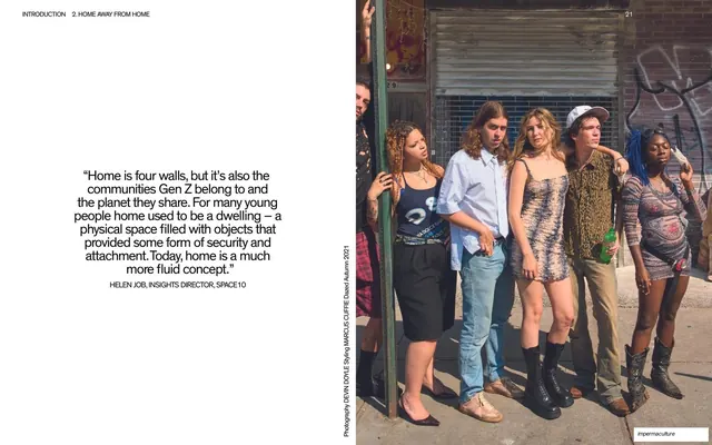
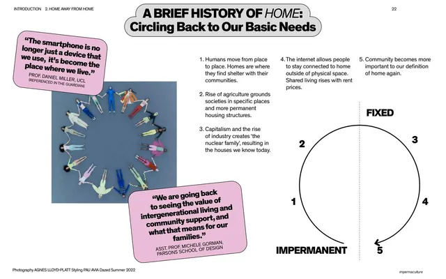
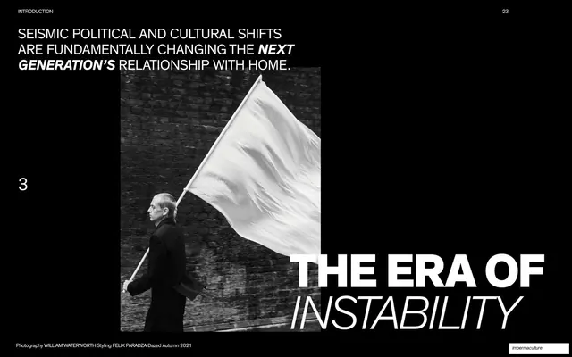
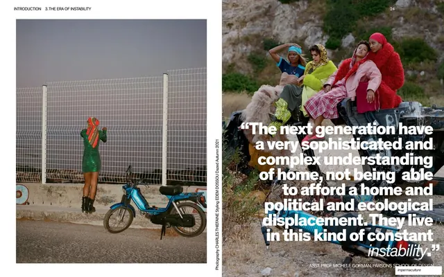
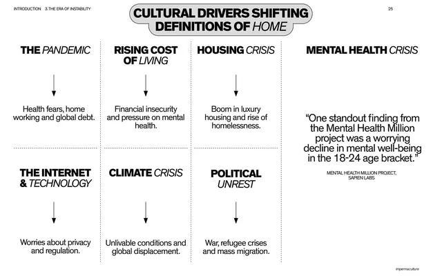
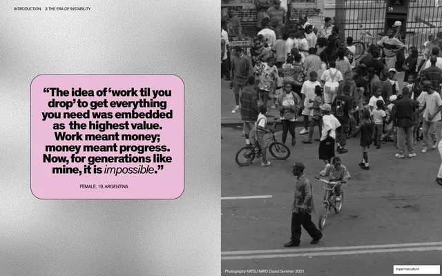
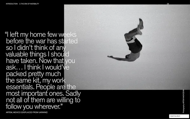
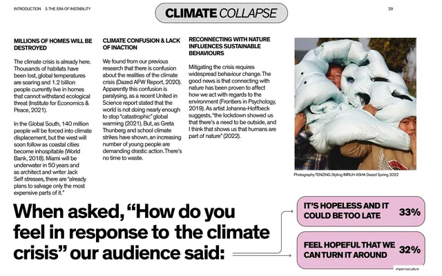
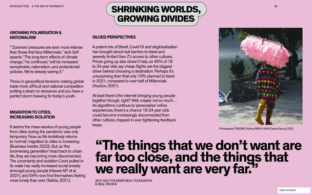
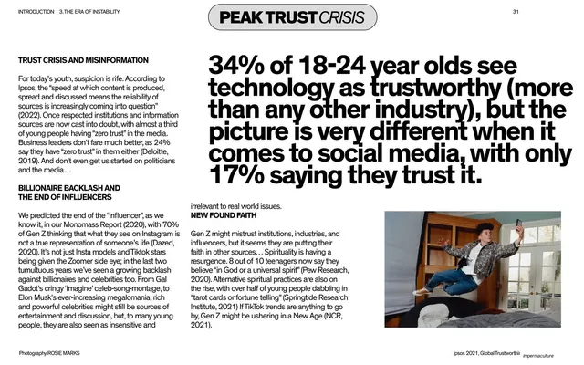
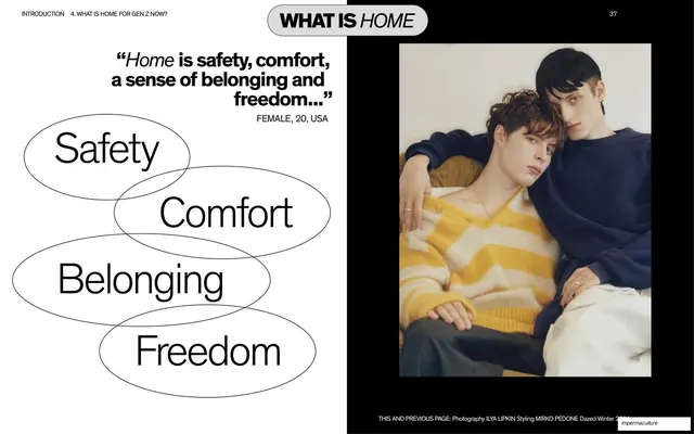
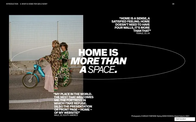
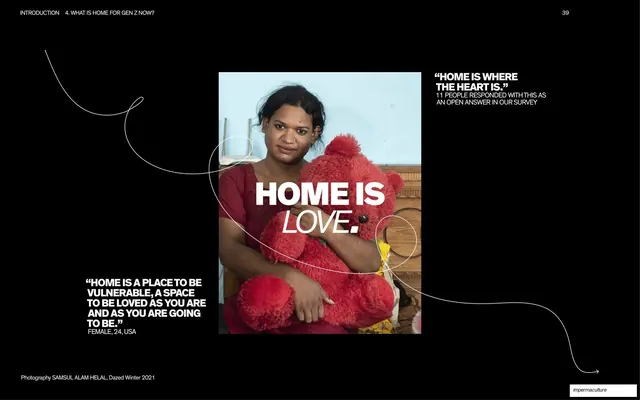
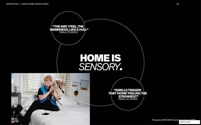
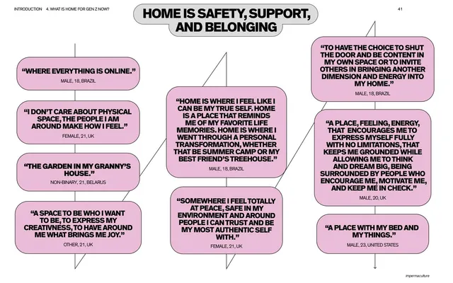
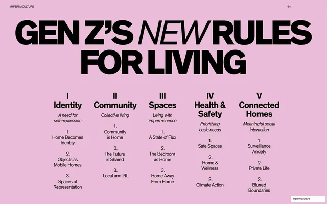
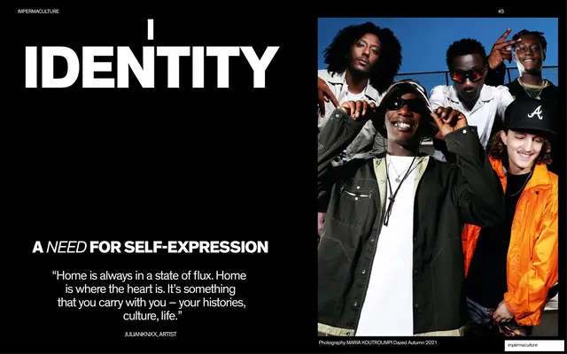
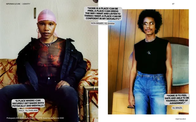
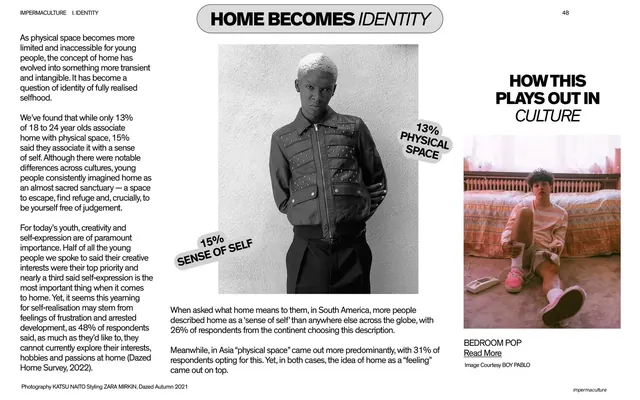
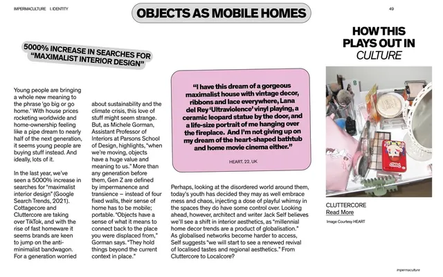
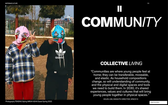
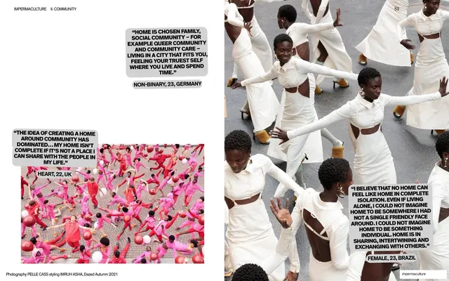
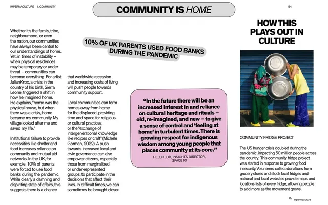
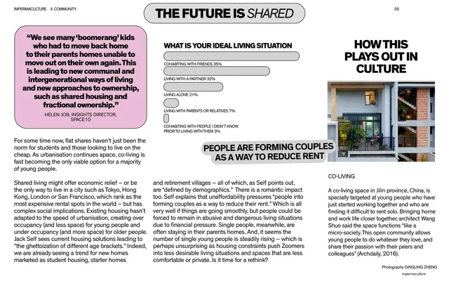
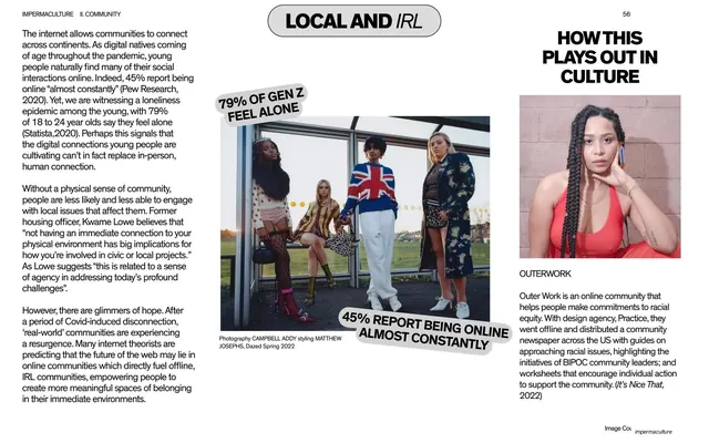
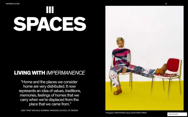
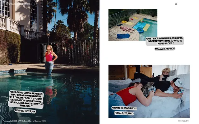
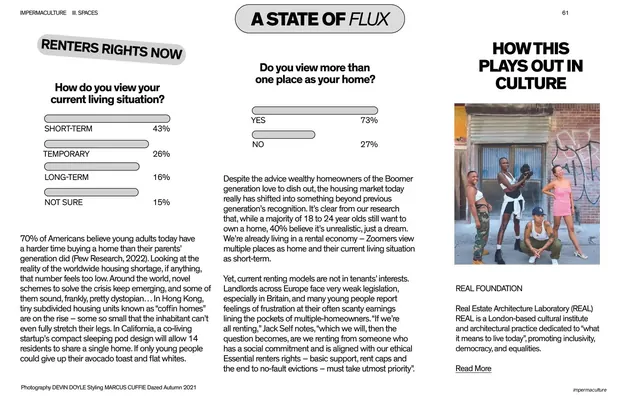
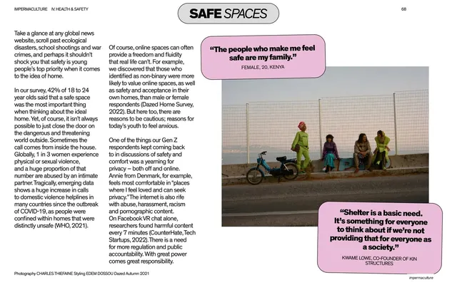
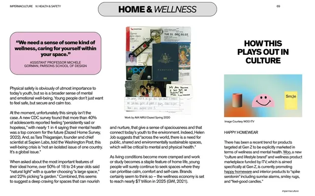
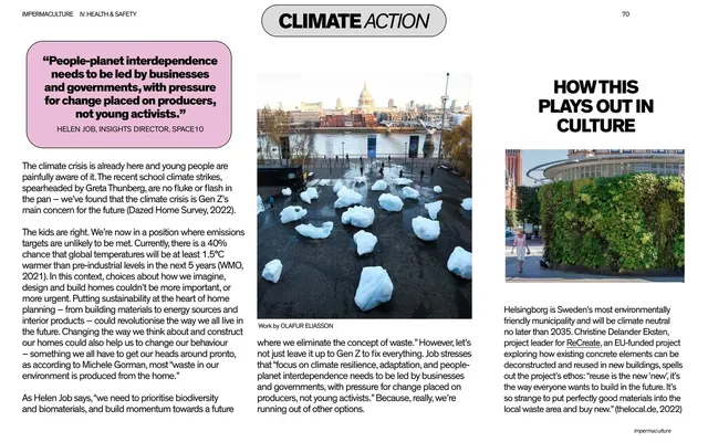
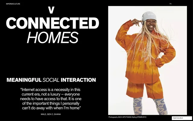
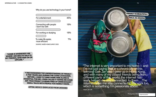
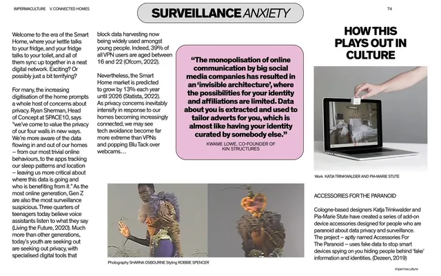
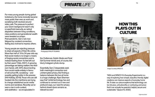
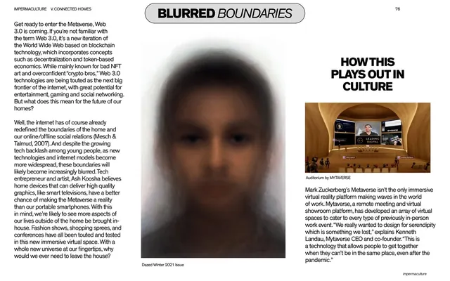
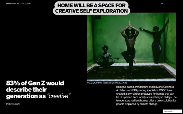
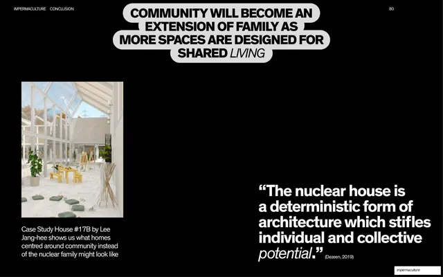
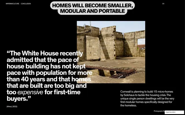
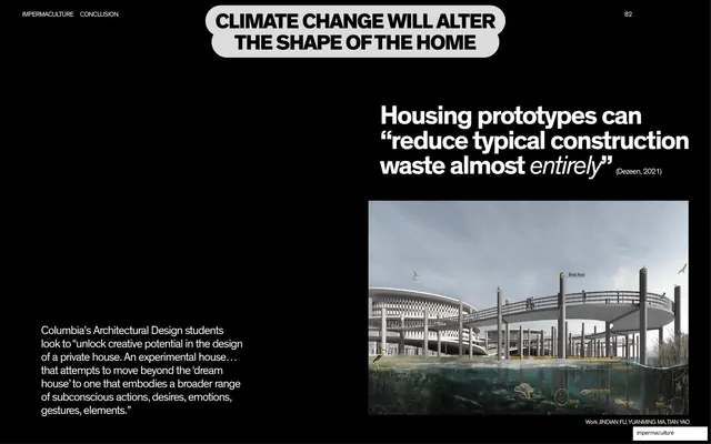
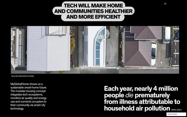
Pages run 16:9 in three core modes. Section dividers are full-black fields with an oversized white headline set in a slanted bold grotesque (mixing upright bold and oblique italic cuts, as in "EXECUTIVE SUMMARY & METHODOLOGY", "INTRODUCTION"), with a centered italic agenda list of the section's pages stacked below. Content spreads sit on white with a tiny all-caps running header naming the section at top-left, a page number top-right, and a rounded white capsule label with a soft drop shadow naming the spread ("CONTENTS", "SUMMARY", "HOME TRUTHS", "METHODOLOGY", "THE AUDIENCE"). The signature accent is a soft baby-pink used for the interactive contents columns, the methodology stat panel, concept-map nodes, and the percentage starbursts. Recurring grammar: big-stat layouts where data is set in very large bold type against thin labels; pull-quotes placed inside grey or white speech-bubble capsules with drop shadows, attributed to a demographic line ("FEMALE, 20, USA"); cut-out fashion figures floating on white; full-bleed documentary and fashion photography paired with a large quote; a node-and-arrow concept map; and a credited-headshot grid for experts and audience voices. The "IMPERMACULTURE" wordmark recurs in a heavily slanted bold sans with the leading "IM" italicized.
Key takeaway
The discipline of a three-color system (black, white, one soft pink) carrying a very long document without ever feeling monotonous, because the black section dividers reset the eye between white content runs. The pill-shaped capsule label is a single reusable device that names every spread and stitches the report together. And the speech-bubble quote capsule turns raw survey verbatims into a recognizable, repeatable editorial object.
Reuse notes
A strong reference for long-form research reports, trend reports, and editorial whitepapers that need to feel cultural rather than corporate. The capsule-label and speech-bubble-quote system is directly liftable for any data-heavy narrative. Leans entirely on excellent fashion and documentary photography (here drawn from Dazed shoots) to carry the image pages, so it needs a real picture library. The oblique display wordmark is bespoke to this report; swap it for your own.
From this deck: Impermaculture Youth and the Future of Living Report
View deck






More like this








Keep what you find
A free account saves references to boards and can send you a weekly email of picks based on what you save.
To see every result, go Pro.