Preview image. Unlock full-res
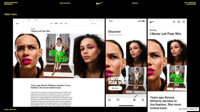
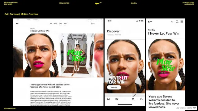
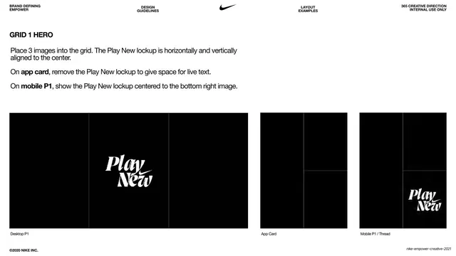
Black slide showing the Grid 1 Hero layout across desktop and two mobile mocks, a three-panel arrangement of Serena portraits with a green Play New script.
Summary
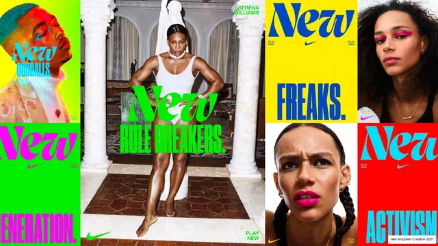
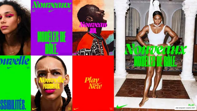
The Grid 1 Hero example: a three-panel multi-image hero shown across desktop and two phones, assembling three crops of a Serena Williams shoot (two tight beauty portraits flanking a full-length figure) under one headline.
Visual description
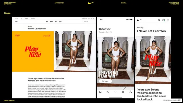
Black background, yellow "Grid 1 Hero" label top-left. Three device mockups in a row. The desktop mock shows a Nike.com page whose hero is a three-cell grid: a tight portrait with magenta lipstick on the left, a small full-length figure with a green "Play New" script in the center, and a second beauty portrait on the right; eyebrow "New Day / I Never Let Fear Win" and a body paragraph below. The two phones reflow the same three crops vertically: one as a "Discover" card stack with "I NEVER LET FEAR WIN" and a "Be brave" pill, the other as a Nike-app article with the portraits, the green Play New lockup on the small figure and supporting copy. Standard utility header along the top. "©2021 NIKE INC." bottom-left.
Key takeaway
Composing a hero from several crops of one shoot rather than a single frame, then showing how those cells restack from a horizontal desktop grid into a vertical mobile sequence. The lone Play New lockup lands on the central full-length figure, anchoring an otherwise busy grid.
Reuse notes
Use when you have multiple frames of one subject and want energy and rhythm in the hero. The reflow from row to column is the key lesson for responsive multi-image layouts. Works best with a coherent shoot so the crops feel like one story.
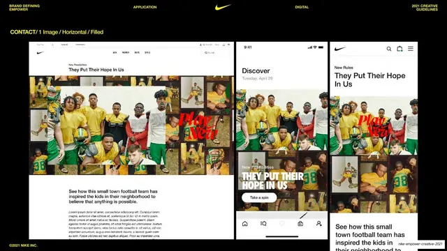
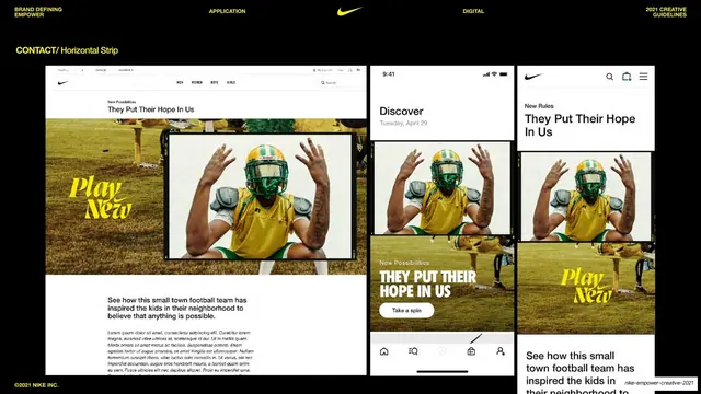
From this deck: Grid 1 Hero, three-panel framing
View deck






More like this
Keep what you find
A free account saves references to boards and can send you a weekly email of picks based on what you save.
To see every result, go Pro.