Preview image. Unlock full-res
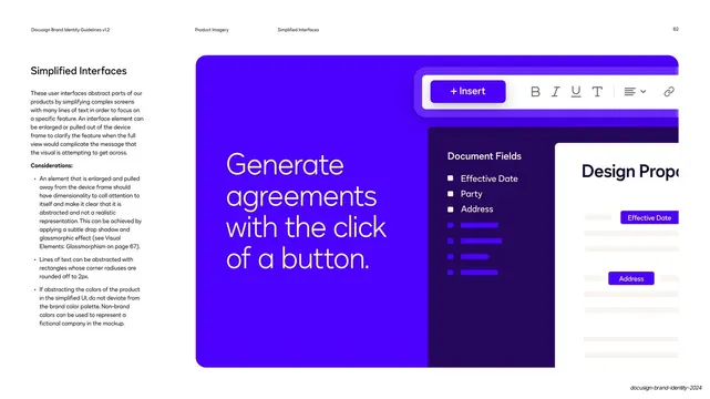
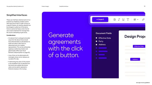
Guideline page on simplified interfaces, shown by an abstracted Docusign editor with a pulled-out document-fields panel on a royal-blue field.
Summary
A guideline page on simplified interfaces, which abstract complex screens to spotlight one feature, shown by an abstracted Docusign editor with a document-fields panel pulled out over a royal-blue field.
Visual description
White page, standard running header (page 62). The left column carries the "Simplified Interfaces" headline, an intro paragraph and a "Considerations" list (enlarge and pull elements out with dimensionality; abstract text as 2px rounded rectangles; keep to brand colors). The right two-thirds is a saturated royal-blue specimen: an oversized white headline "Generate agreements with the click of a button." anchors the left, while a simplified editor toolbar with a violet "+ Insert" button floats at top. A dark "Document Fields" panel lists Effective Date, Party and Address with greeked violet bars, partly overlapped by a white "Design Prope..." form panel where field tags are highlighted.
Key takeaway
Abstracting a dense product screen down to greeked bars and one or two real labels, then pulling the key element forward with depth, so a single feature reads instantly. Non-brand text becomes texture, not content.
Reuse notes
Best when you need to focus attention on one capability without the noise of a full screenshot. The greeked-bar abstraction and pulled-out panel are reusable across feature marketing. Stick to brand colors as the page warns, reserving off-brand color only for a fictional company.
From this deck: Simplified interfaces guidance
View deck










More like this



Keep what you find
A free account saves references to boards and can send you a weekly email of picks based on what you save.
To see every result, go Pro.